I’m constantly discussing relative strength, and I don’t just discuss it with respect to individual stocks. I want to know where money is rotating to among industry groups. It’s why I keep an industry group relative strength ChartList at EarningsBeats.com. I view every industry group vs. the S&P 500 on a 3 year weekly chart with an absolute chart of the industry group in the panel below. I can quickly assess the strength of an industry group. The perfect setup for me is when the relative PPO is positive, preferably above +1, and relative price is above a rising 20 week relative EMA, which is also above its 50 week relative SMA.
Let me give you an example – home improvements ($DJUSHI):
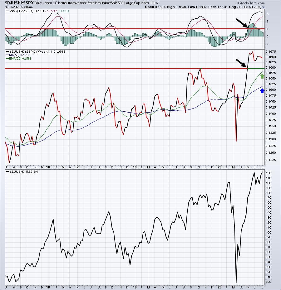
The DJUSHI is in no way my favorite industry group, but in this example, the DJUSHI broke out to a new relative high vs. the S&P 500 in early-May. It also saw its relative PPO surge above +1 at the same time. In my view, that suggests to me that home improvement stocks are becoming beneficiaries of market rotation. Therefore, if I see a home improvement stock testing key price or moving average support, I’d be more inclined to buy it. Same goes for a breakout in the industry.
On the other side of the spectrum are industries with awful relative strength, highlighting the fact that money is rotating AWAY from that group. For instance, check out hotels ($DJUSLG), which, like the DJUSHI, belongs to the consumer discretionary sector. One look at this chart and you’ll realize that not all consumer discretionary industry groups are created equal:
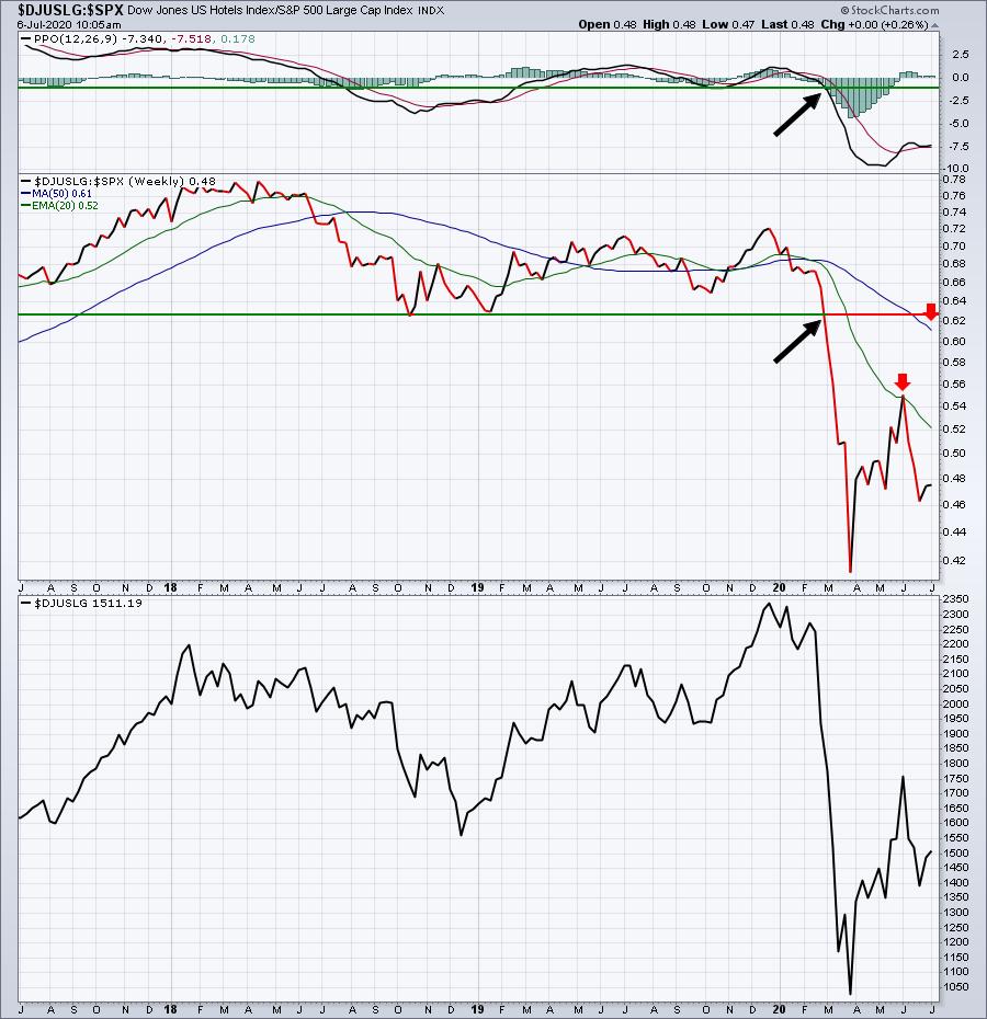
Do you see the huge difference in chart configuration? With the DJUSHI, we saw a rising 20 week relative EMA (green arrow) above the rising 50 week relative SMA (blue arrow). But the DJUSLG shows the 20 week relative EMA well below the 50 week relative SMA (red arrows). The DJUSHI is being accumulated, while the DJUSLG is being distributed.
The thick black directional lines point to a key relative breakout on the DJUSHI and a key relative breakdown on the DJUSLG. Understanding this rotation is critical to improving your investing and trading success. Our portfolios concentrate on leading stocks within leading industries. There’s a reason why our Model Portfolio is up 107.36% on a cumulative basis since November 19, 2018, rising more than 6x that of the S&P 500, which is up 16.33% over the same period. As of 10:15am ET this morning, our Model Portfolio was up another 3% or so, well above the S&P 500’s 1.24% gain.
During this afternoon’s “2020 2nd Half Market Outlook” webinar, I’ll be discussing U.S. equities, global equities, the dollar, gold, other commodities, best sectors, best industries, our portfolios, our ChartLists, etc. If you’d like to join me, but are not currently an EarningsBeats.com member, CLICK HERE for more details about the event and how to sign up.
Happy trading!
Tom