The second graph is the so-called “scariest job chart” ever. That graph shows the percent job losses for all recessions since WWII.
Joe Weisenthal at Bloomberg asked if I could make a similar graph showing percent permanent job losers.
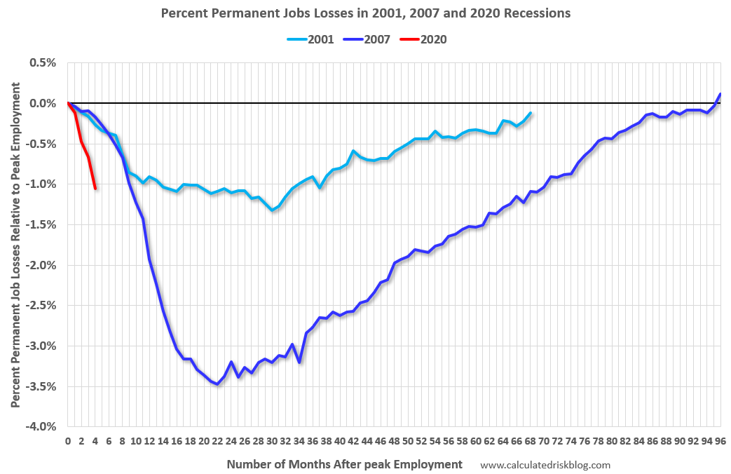 Click on graph for larger image.
This graph shows permanent job losers as a percent of the pre-recession peak in employment through the June report.
This data is only available back to 1994, so there is only data for three recessions.
As temporary job losses become permanent, the percent of permanent job losers will probably continue to increase for some time.
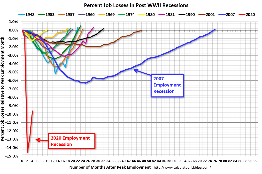 The second graph shows the job losses from the start of the employment recession, in percentage terms.
The current employment recession is by far the worst recession since WWII in percentage terms, and the worst in terms of the unemployment rate.