Time Area is an incredibly simple indicator, the nature of which belies its usefulness. The default setting plots the mid-value of the Daily, Weekly, Monthly, Quarterly, Semi-Annual and Yearly timeframes. Whilst the first two are simply for understanding the recent price action, it is their connection to the others and the stepping process they create that formed one of my key strategies in understanding and identifying timing points for when unloved sectors can rally, while the darlings become unfashionable and retreat back into obscurity.
When running a Private Fund trading American equities some years ago, one of my primary tasks was to build Fundamental-based systems for both individual Stocks and Sectors. I was told by my paymasters that identifying the next Sector that would perform was the secret. Whilst I had a history of experience of fundamentals on all asset classes in the Futures and economics world, stock fundamental analysis was not something I had ever approached. Armed with some impressive Fundamental System building software, the vast array of statistics and measurements presented a daunting and thankless task that, in truth, I thought would be ultimately pointless. Surely, if it could be done, institutions with far more resources and intelligence than me would have already done it.
I researched a multitude of reference books and sources and began putting Statistics and Thresholds together in order to start the process of putting some sort of coherent strategy together. It quickly became apparent that it was common for a group of stocks placed within the same Bullish fundamental statistical space, often within the same sector, to behave in a completely different fashion. Some would go on an impressive trend, some do absolutely nothing and, most illogical of all, some would slump. This inevitably led to the creation of more filters, rules, criteria and an element of optimization in what I knew was effectively curve-fitting the systems to the data. This is breaking a cardinal rule. Effectively, the system looks great, but due to the multitude of rules, the prospect of similar performance moving forward was highly unlikely and the complexity meant that it would be virtually impossible to fix if indeed that did happen.
It was when analysing a set of results across a cross section of sectors that the illogical nature of finding the next best thing since sliced bread rammed itself into me. In the first 6 months of 2016, the market when on an impressive rally of some 20% and, to my astonishment, the strongest and best performing sector for much of that period was Consumer Staples. Within that the second strongest stock was Campbell Soup (CPB). Surely Consumer Staples is a defensive sector, and who is buying soup as we move into the summer?!!
Exasperated and thoroughly wound up, my eureka moment came to me. I was looking at the problem from the wrong end. Finding out what had been the best performing sectors back through time was readily available, and it soon became clear that there were frequent occasions where sectors rose to the top of the tree and had no fundamental justification statistically to justify it. Therefore, it was inevitable that reality would resume at some point, and those sectors would then slide back down the tree and revert to their more logical position in the hierarchy of the market in what is an endless cycle of rotation. Going back through data revealed that, often, they would go back to where it all began. Whilst this was incredibly useful information, working out a way for when this retreat would come presented a far more difficult problem, as timing in trading is key. I already knew that using fundamental criteria for when these falls would happen was pointless. Thankfully, I could therefore return to Technical-based methods and begin building a new suite of indicators to tackle the problem.
The concepts of Steps and multiple-timeframe relationships were already fully entrenched in my mind, the first ones built over 10 years previously. The nature of stocks and the often-elongated length of trends were particularly relevant to this thesis. After various false starts, Time Area was born, its simplicity so stark that I was embarrassed to tell people what it was and kept the code hidden. However, the simplicity of its concept and visualisation revealed how important the connection between Time and Price was in identifying timing points.
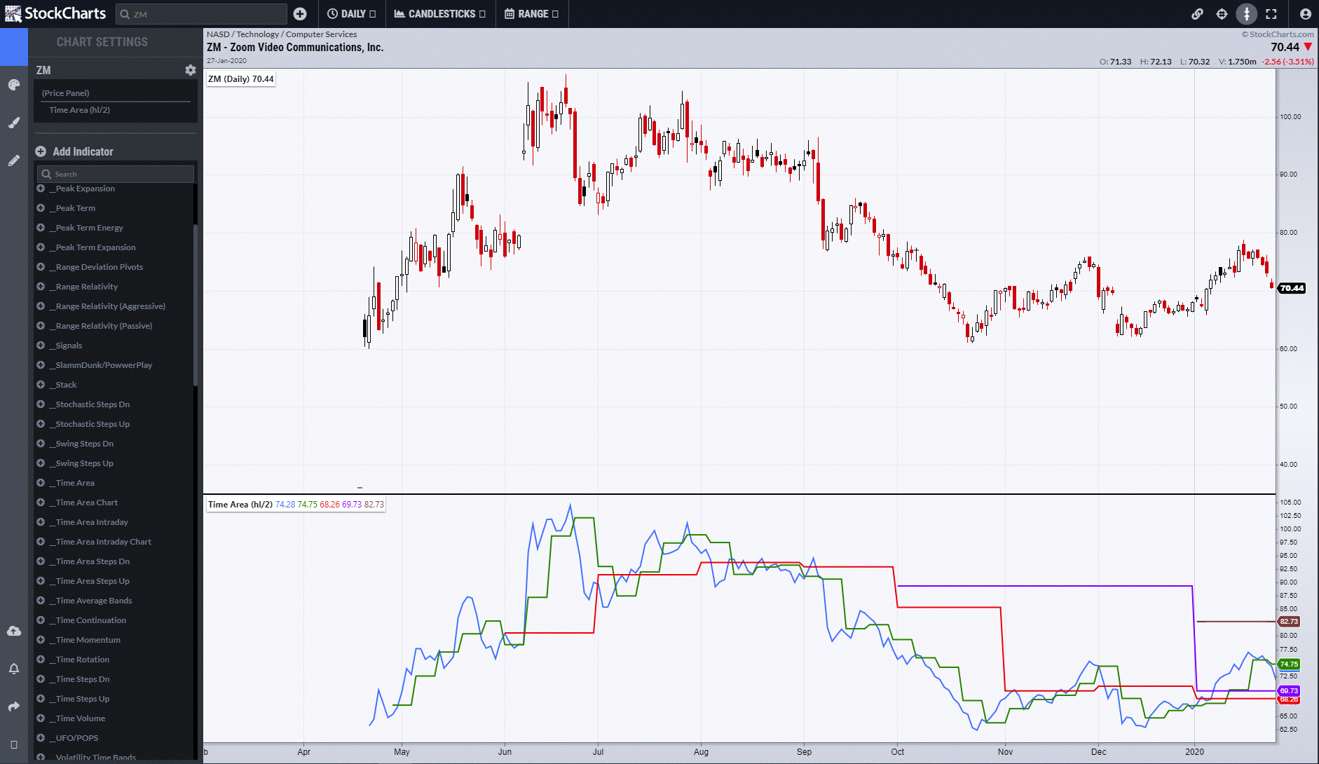
Zoom (ZM) has been living up to its name, and its relatively brief existence publicly provides a good example of what I mean. The chart below shows it first 6 months of trading. After an initial euphoric rise from September last year, price drifted back to almost its launch point. Into year-end, the red monthly line stepped down with price, as did the purple quarterly. Up to that point, the process of Steps was negative and the levels represented resistance. The blue line is the daily value and green is the weekly.
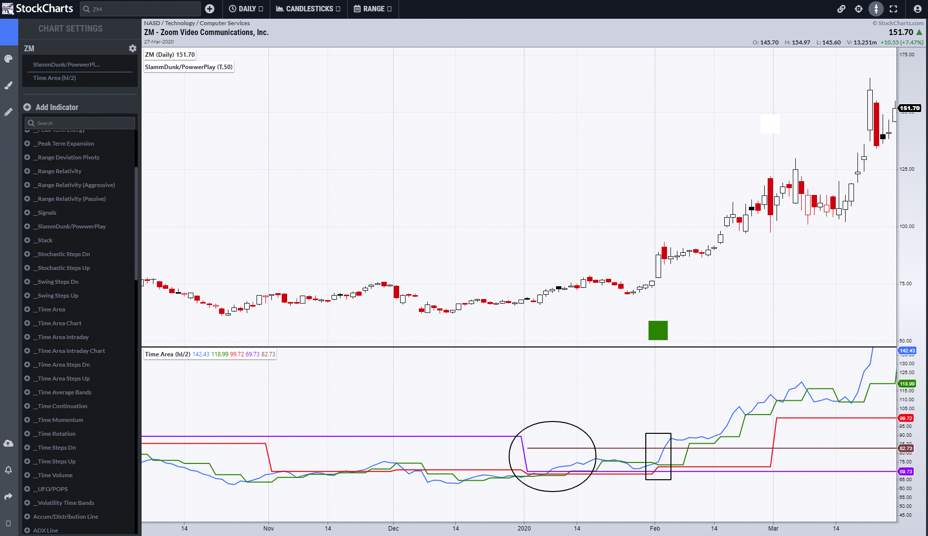
Move forward to January and a key shift in the relationship between Price, Time and Space occurs. Monthly and Quarterly values drop, but Price quickly moves above those points and so what had been resistance at the end of the year suddenly becomes support (circle). Subsequent to that, at the beginning of February, the Monthly value moves up, indicating a change of trend. A few days later, price breaks above the final Semi-Annual value (brown line,) and creates a Powwerplay buy signal at the same time (green square).
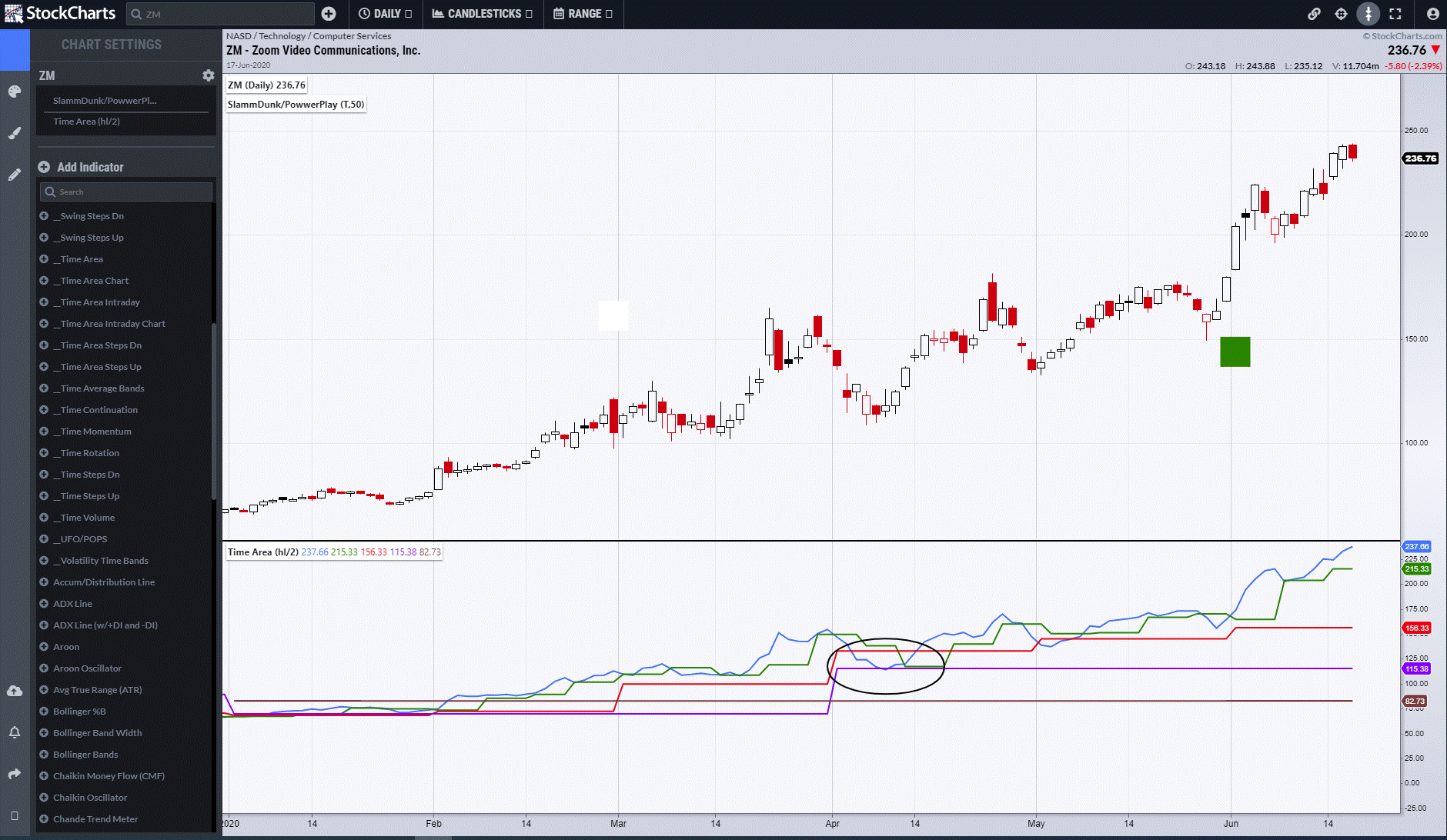
Higher Timeframe Time Area points also act as potential support points. The move back down in April saw the Quarterly Purple Line hold the pullback (circled), followed by an aggressive Powwerplay signal at the beginning of June. Time Area also has proactive properties as time comes towards the end of quarters. At present, barring a major collapse, monthly and quarterly and semi-annual levels will rise at the end of this month and create a raised set of supports.
In truth, with what is going on in the world, identifying Zoom as a beneficiary was a bit of a no brainer. However, a prominent trade house recently identified Zoom as the most overvalued stock of all, since which time it has advanced another 50%. Logic plays no part when a stock or sector is fashionable.
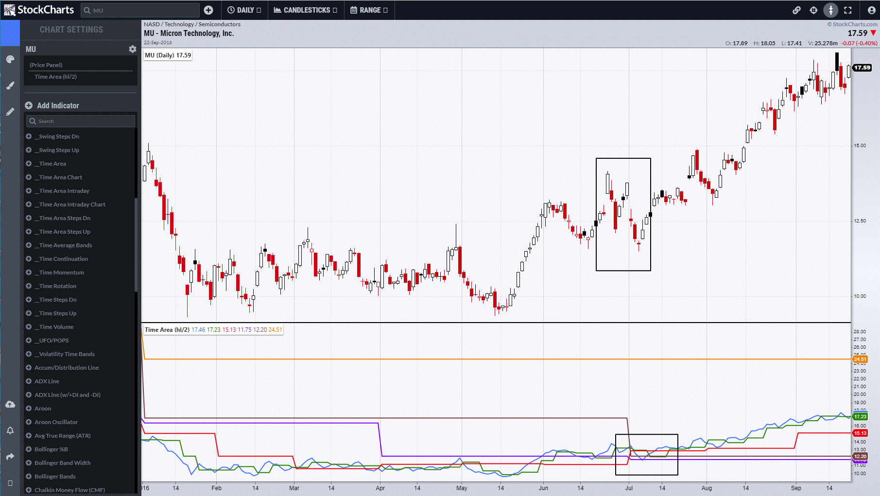
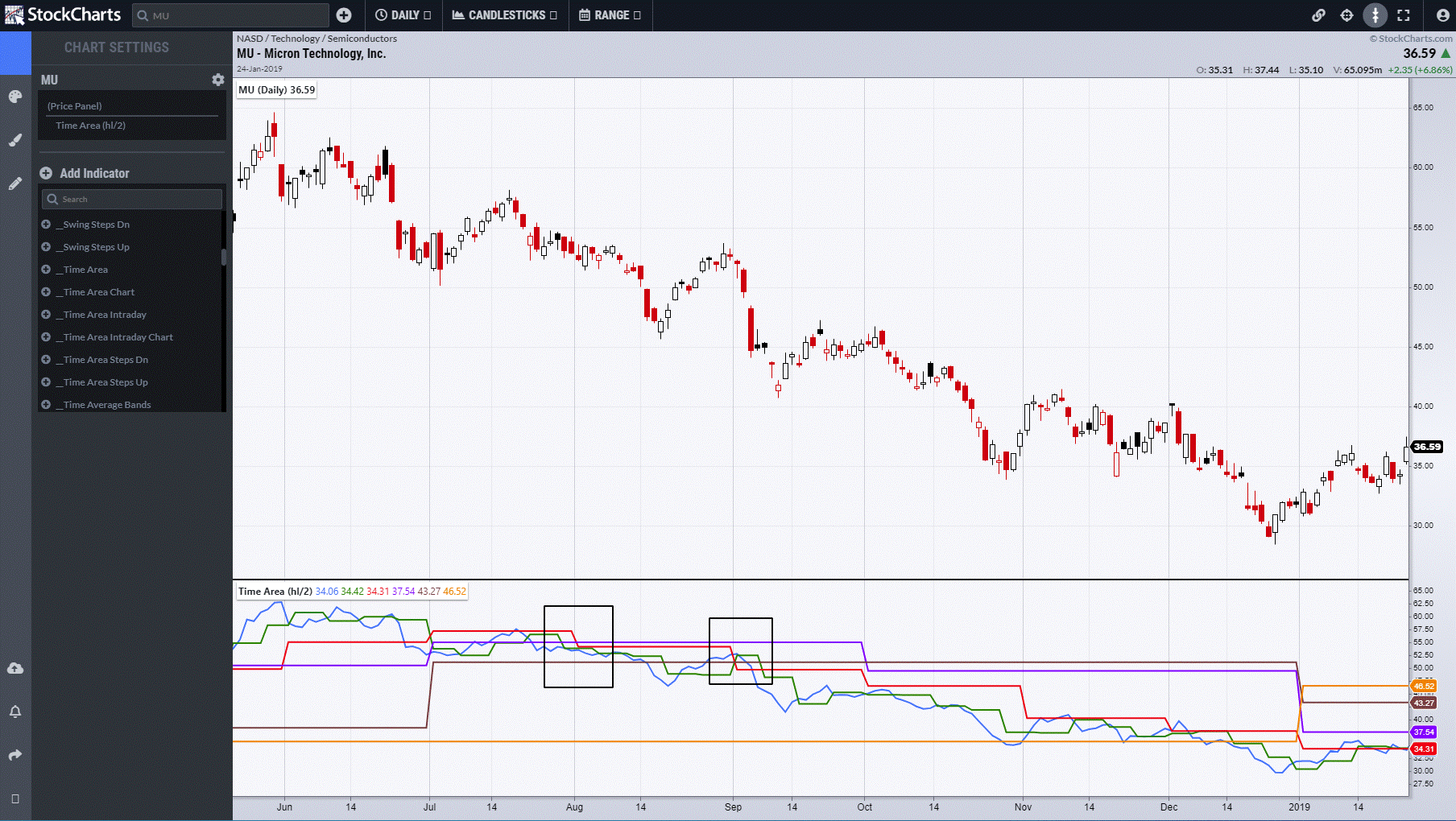
Semiconductors are a sector that goes in and out of fashion and Micron Technology (MU) is a product of this process. In 2015, price fell throughout the year as its losses widened and revenue shrank. Throughout this, Time Area consistently stepped lower.
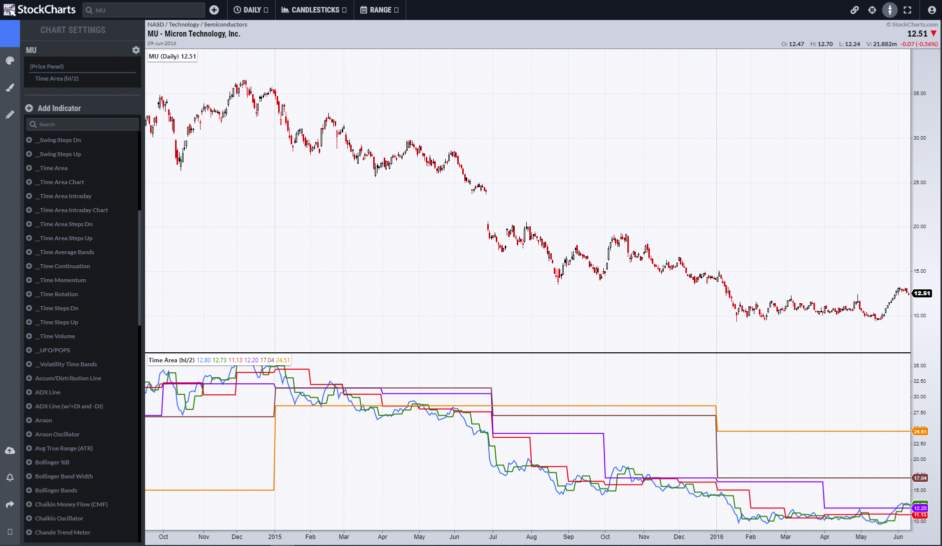
Move forward to July 2016 and a poor set of results saw a drop. However, Time Area had shifted significantly at the beginning of July, with resistances shifting to supports, signifying a trend change with Space to rally to the Yearly Level at 24.51. This element of Time creating a bottoming process before resistance shifts to support is the crucial timing element. Price must have Space to rally before it can do so.
The rest of the year saw Time Step up before the importance between Time and Price came into focus once more. Late December saw Micron post its first profit in many quarters, although the share had already advanced over 100%. The beginning of 2017 saw the Yearly value (yellow line) move from resistance to support and therefore once again open up Space to move higher.
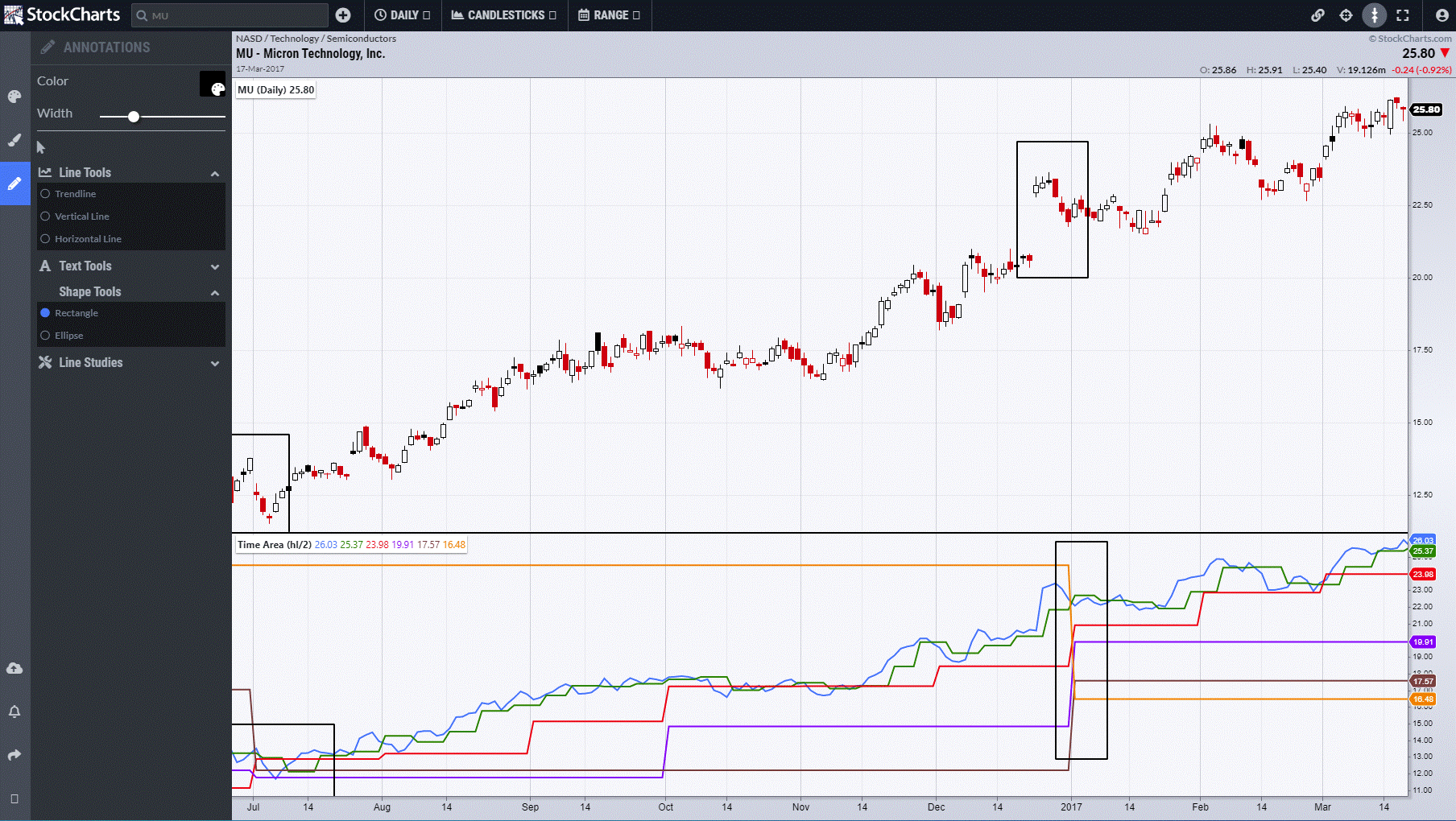
July saw another timing moment as the Semi-Annual level rose to 27.23, providing a raised support point which held.
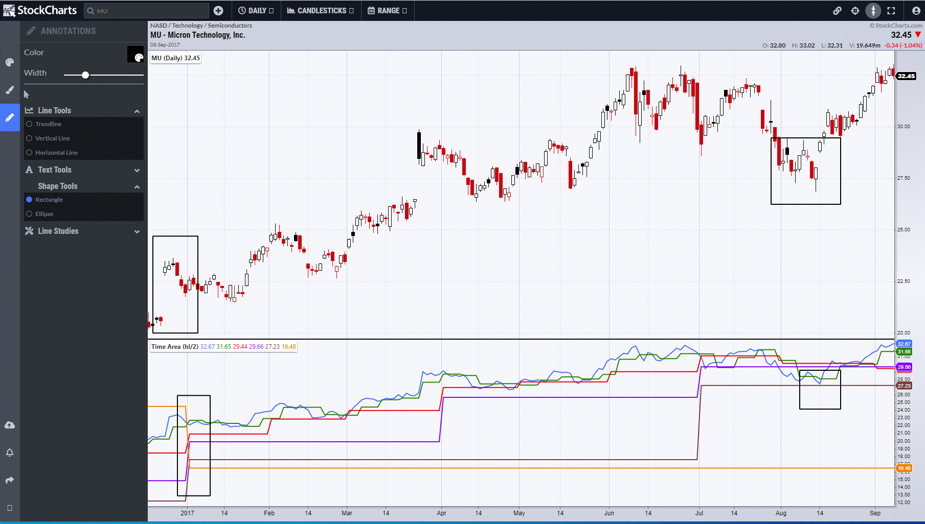
Year-end saw longer-term values rise, with Semiconductors having been in the top five sectors through most of the year.
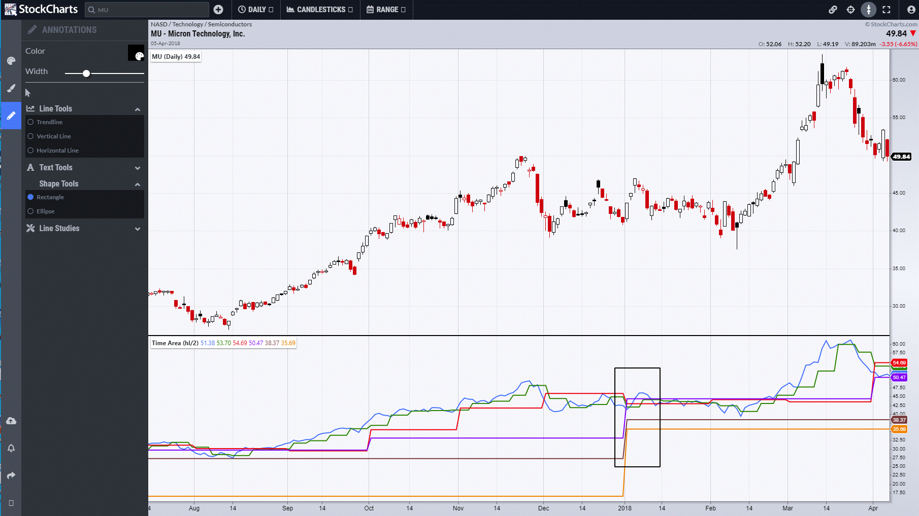
The second half of 2018 saw all of the gains of the previous year given back as Semiconductors went out of fashion. The key moments came in August and September, when Monthly levels dropped twice and price broke the newly risen Semi-Annual support, this completing the topping process.
I can be contacted at shaun.downey@aol.com to answer any questions.
Shaun Downey