Note: None of the markets, ETFs or stocks listed in this article are recommendations to buy or sell. This article is intended for educational purposes only.
The Indexes, $SPX, $COMPQ and $INDU, have all rallied and tested important resistance areas. But there are indications that there will be at least short-term weakness ahead.
Looking at Chart 1 below of the $SPX, you will see pink dashed horizontal lines marking the large gap down from February 2020. Price tested the lower end of that gap and has not moved above it. Now, there is an Island Reversal pattern, which indicates weakness and more downside. This pattern is marked with yellow circles on the gap up on June 5, 2020, followed by a gap down on June 11, 2020.
During the last few days, Price has attempted to fill the gap, but failed to do so and, as of the close on June 19, 2020, has traded down with large volume.
Looking at the RSI, marked with a purple dashed horizontal line, we can see that this is an important support area – and it appears it will be tested. If there is a break below with price lows, that would be negative for this index.
The MACD histogram below the RSI is also showing signs of weakness and is below the zero line. It is also important to observe the OBV located in the lower window; it is turning down at this time, indicating potential weakness as well.
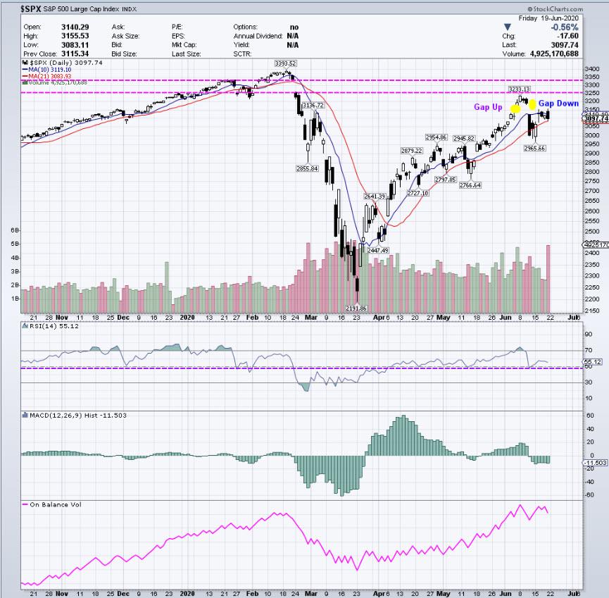 Chart 1 – Daily $SPX
Chart 2 below features $INDU on a daily view, which shows a similar picture. However, $INDU has been weaker than the $SPX and $COMPQ on the rally from the March 2020 lows. Also noteworthy is that the $SPX is showing an Island Reversal gap pattern.
The OBV is in the upper window in this chart and has clearly turned down. The upper portion of the range (shown in blue horizontal lines), which had an upside breakout in late May 2020, has been tested. A price move below that test should lead to lower prices, back into the range and possibly to the lower end of that range at a minimum.
As you can see, the RSI and MACD are very similar to the $SPX chart, as is the high-down volume bar from June 19, 2020.
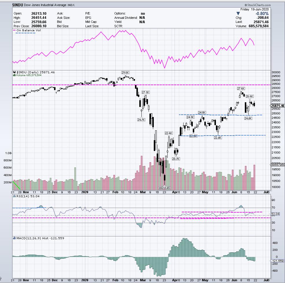 Chart 2 – Daily $INDU
We’ll take a look at the $COMPQ on a daily chart in Chart 3 below.
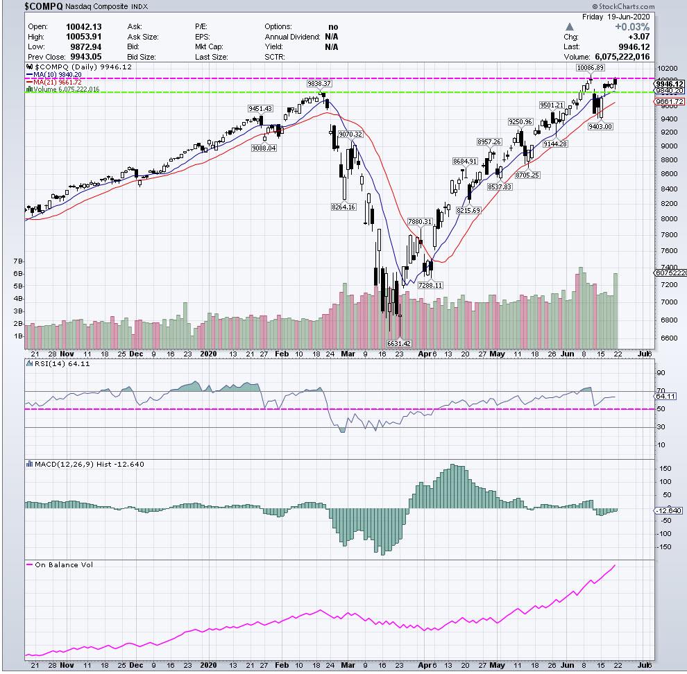 Chart 3 – Daily $COMPQ
As I have been pointing out in all of the articles posted here, the $COMPQ (NASDAQ), has been stronger than the $SPX and $INDU and is still exhibiting that here. However, there may be indications of potential weakness in the short-term.
The upper pink horizontal dashed line in Chart 3 is marking the current upper resistance and highs the $COMPQ reached above the February 2020 highs prior to the severe decline. The green dashed line just below that is marking the close of the February 2020 highs. A close below this price area can signal the start of a move down. Conversely, a new closing high would indicate more upward price movement.
The Daily RSI has shown strength up to the recent highs, but could be poised to turn down for a test or move below where the pink horizontal line is marked on that indicator. Daily MACD is in a sideways range and did not make momentum highs on the move to new highs in early June. Daily OBV is still showing strength with a steady upward slope.
Let’s now look at a 60 minute chart of $COMPQ below (Chart 4). Prices have stalled, testing the recent all-time highs. The upper pink dashed line is the price area $COMPQ will need to have a strong close above for confirmation of these highs. The green dashed lines below are areas of support price currently needs to hold. Breaking below these areas may signal further downside.
The RSI in the upper window shows some negative divergence from the June 10, 2020 price high. Price had a gap down and, in the last few trading days, has been testing this area with a sideways range.
(Please refer to the article “Coils, Coils and more Coils” posted May 7, 2020 for more information on these types of patterns.)
The RSI is also in a sideways range on the 60-minute chart, while the MACD is showing negative divergence with these last tests.
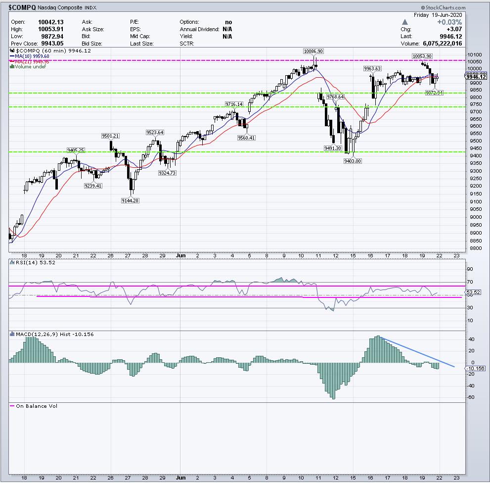 Chart 4 – 60-Minute $COMPQ
Chart 4 below shows OBV on a 60-Minute NASDAQ Futures chart. The OBV in the lower window appears to be just starting to turn down.
There was a formation and completion of a Butterfly Sell pattern, which is described in the book Trade What You See: How to Profit from Pattern Recognition, written by myself and Larry Pesavento.
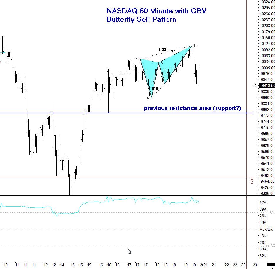 Chart 5 – 60-Minute NASDAQ Futures
These patterns are known as “Reversal” patterns and, at times, can precede large moves. Also marked on Chart 5 is a previous resistance area that now should be monitored for support. That means observing if it holds as support or breaks. Please refer to Chart 4 for other marked areas of support to monitor.
The top of the Butterfly pattern and the recent highs are important areas of resistance now for the NASDAQ and corresponding levels on the $COMPQ chart. This pattern also gives us an area to reassess the analysis if there is a price move above the high of the pattern at this point.
It’s always important to learn entry skills, which include combining elements of intraday time frames, momentum indicators and other price patterns to control risk and also, at times, waiting on the sidelines until there is confirmation. There are trading techniques that can be learned and implemented to control risk and monitor the price behavior. We never know what price will do – the only element we can control is the risk.
If you would like to learn more about these patterns and programs to trade them, please visit me at my website www.tradingliveonline.com or feel free to email me at ljouflas@msn.com.
Best wishes for successful trading!
Leslie Jouflas, CMT