As the market grinds sideways heading into the end of April, it is a mixed bag as to which direction we are going.
Last week, StockCharts rolled out some new features and they can really help us see the market in a different light.
One of the big investing styles is reversion to the mean. The reversion can be planned from a number of different measurement tools, but a common one is a moving average. I did a screen shot showing the new tool display, and I really like the functionality of it.
The table below is one I produce each week in my newsletter. I have a few specific ETF’s in a list as well as the US Sectors. I changed the sort order to show how much each sector/ETF has changed over the last week in the % CHG – percentage change – column. That’s not new. But over on the right, there is a new column available. In this example I chose the 50 period moving average. This column displays how far above or below the moving average the current price is. It shows the current price level of the 50 DMA and the difference is colour coded.
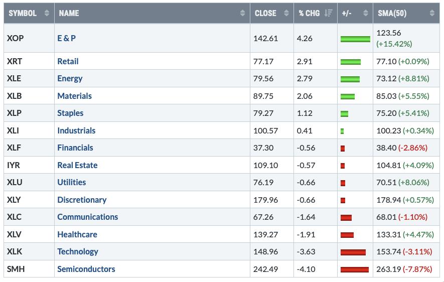
I think this table does a wonderful job of explaining the current investing environment. Technology and Semiconductors are the farthest below the 50 DMA. Staples, real estate and utilities are very strong showing the current climate is defensive. It also shows the energy and materials as having extreme outperformance, especially E&P.
The outperformance of semiconductors compared to utilities (SMH:XLU top panel) ended in mid-January. Since then each semi-conductor rally has been stronger, but each rollover longer/deeper. Until this trend changes again, this is a chart advising us of caution. You could also pick XLK:XLP on the lower panel, but it is telling us the same thing.
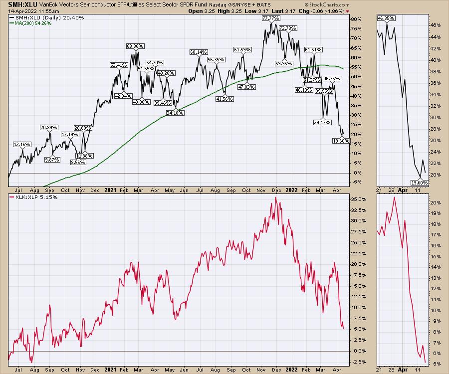
This new display by StockCharts can help us look for mean reversion trades, but you need a signal to start investing in one. So far that is not showing up for the technology area.