
The title for this article is a quote from John Murphy’s book Trading with Intermarket Analysis. And I couldn’t help but think of it when I was watching the Relative Rotation Graph that shows the rotation for different segments of market capitalization.
The most well-known RRG is the one that shows the rotation for US (large-cap) sectors using the SPDR ETFs. But there are many more ways in which RRG can help you get a view on market rotations that take place in specific areas of the market.
The chart below shows the rotation for Large-, Mid- and Small-cap indexes against a broad market index that includes all segments. This is a pre-defined RRG universe that you can access from the Groups drop-down.
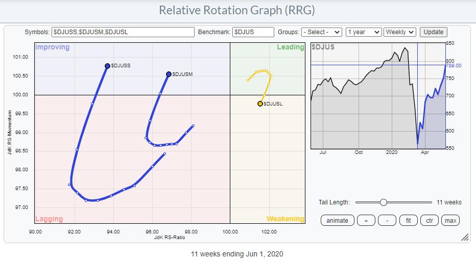
This RRG uses the Dow Jones family of indexes.
- $DJUSS – Dow Jones US Small-Cap Index
- $DJUSM – Dow Jones US Mid-Cap Index
- $DJUSL – Dow Jones US Large-Cap Index
- $DJUS – Dow Jones US Index (benchmark)
An alternative setup would be to use the S&P index family:
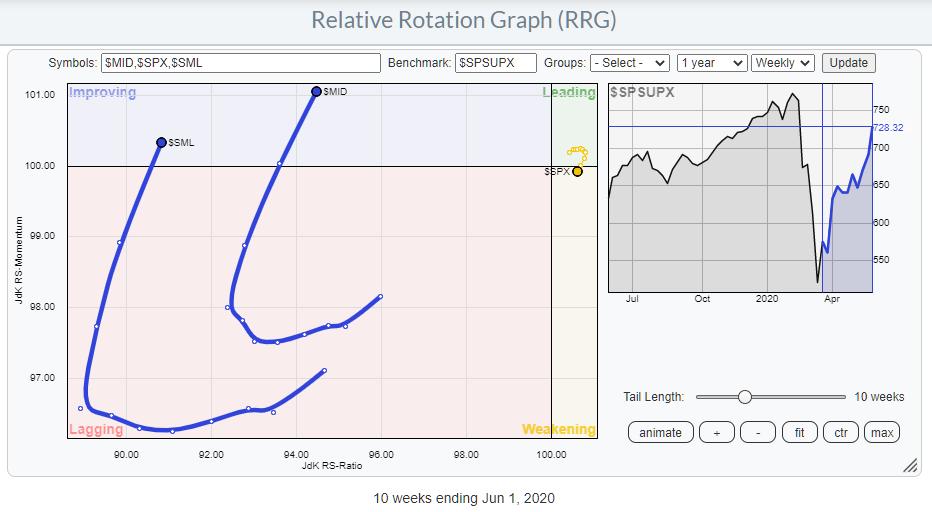
As you can see, there is no meaningful difference between the two RRGs and the positions of the tails on them. So the conclusions on either universe would be the same.
A family of tradable instruments that could be used to play these rotations are SPY, MDY and SLY, in combination with the benchmark SPTM.
From an RRG point of view, the rotations for Small- and Mid-Cap are very clearly improving over the last weeks. In particular, the increased RRG-Velocity indicates that there is (relative) power behind these rotations.
Going Back in History
The RRG tool on StockCharts.com allows us to scroll back 10 years in history. In this period, there were, imho, three (major) lows, plus the low that we set in March and out of which we are still rallying.
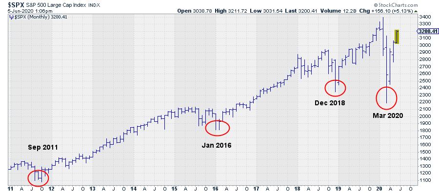
These lows (visible) were set in September/October 2011, January/February 2016 and in December 2018.
What I wanted to do is go back in time and look at the positioning of the tails for the three size segments and see if we can find similarities that, maybe, we can project on the rotational pattern that we see at the moment.
September / October 2011
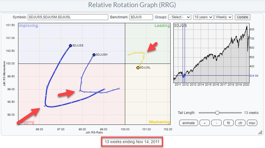
The first occurrence is in 2011, when the low in the S&P 500 was set in September/October of that year. The RRG above shows the tails for the three segments around that period and I have tried to put the end date of the tail at a position that more or less mimics what we are seeing now.
The red arrows that indicate where the tails “turned” are at 3 October. Obviously, that was not THE day that you could make a call for improvement of small- (and mid-)caps, but it provides guidance with respect to the time table. Depending on how aggressive one would read the RRG somewhere between the start of October and mid-November, where the tail ends, one could pick up the idea that small- and mid-cap stocks were starting to pick up over large caps.
January / February 2016
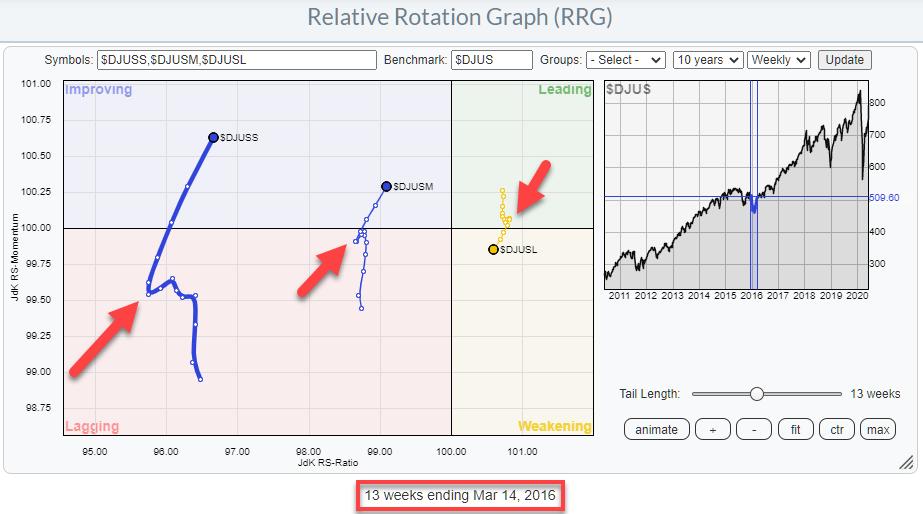
The second occurrence was in January / February of 2016. Again, the RRG shows the tails around that period. The endpoint is the week starting 14 March. The arrows at the hooks on the tails are pointing to 8 February.
December 2018
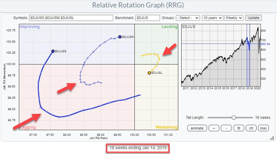
The third occurrence was the Christmas dip in December 2018.
The tails end in the week starting 14 January. The arrows point to late November. On this occasion, mid-caps actually started to turn significantly earlier than small-caps and large-caps.
The Low is In?
On all three occasions, the tails for mid- and small-caps started to rotate oppositely to large-cap. Also, in all three occasions, the mid- and small-cap tails were positioned inside the improving quadrant and had started heading towards the leading quadrant, while large-caps already crossed over into weakening and started heading towards lagging.
When we look at the current constellation for this universe of US stock market size-segments, we see a situation that is very similar to the three historical situations that we saw above. All three of these occurrences were the prelude to a further rally and the confirmation that the low was in. That pretty much negates the possibility of a bear market rally.
Of course, the sample size is very low, maybe too low. But, getting back to John’s observation that Smaller Stocks Lead at Bottoms, and combining that with the observations of large-, mid-, and small-cap rotations around these lows, it’s another argument for a further bullish scenario and the assumption that the low is in place.
#StaySafe,
–Julius
My regular blog is the RRG Charts blog. If you would like to receive a notification when a new article is published there, simply “Subscribe” with your email address.