Those of you who regularly watch Sector Spotlight on StockchartsTV will know that I have a few segments that come back on a regular basis.
Every last Tuesday of the month I discuss the seasonality for sectors going into the new month to see if the historical seasonal pattern aligns with the actual rotations as it is currently seen on the Relative Rotation Graphs.
Every first Tuesday of the month I review the completed monthly charts after the previous month’s close. This helps us to stay aware of the long-term trends.
And every quarter I do a review of the Sector Rotation Model as Sam Stovall presented it in his “S&P’s guide to sector rotation”.
After the last episode of Sector Spotlight for June I got a message from a viewer asking whether:
“The above link from Stock charts* you have shared before. Does this override the monthly seasonal grid you have created? For example, XLK seasonal has a strong July – Aug, but the Late Cycle above chart doesn’t include XLK.”
*that links to the sector rotation model
My short answer was:
“No it does not. This is The Sector Rotation Model it’s a different approach from the seasonality analysis. As I will be doing the Sector Rotation Model segment next week, I will answer this question in the show as well for clarity.”
And of course …… I forgot 😉
So here we go!
The Sector Rotation Model
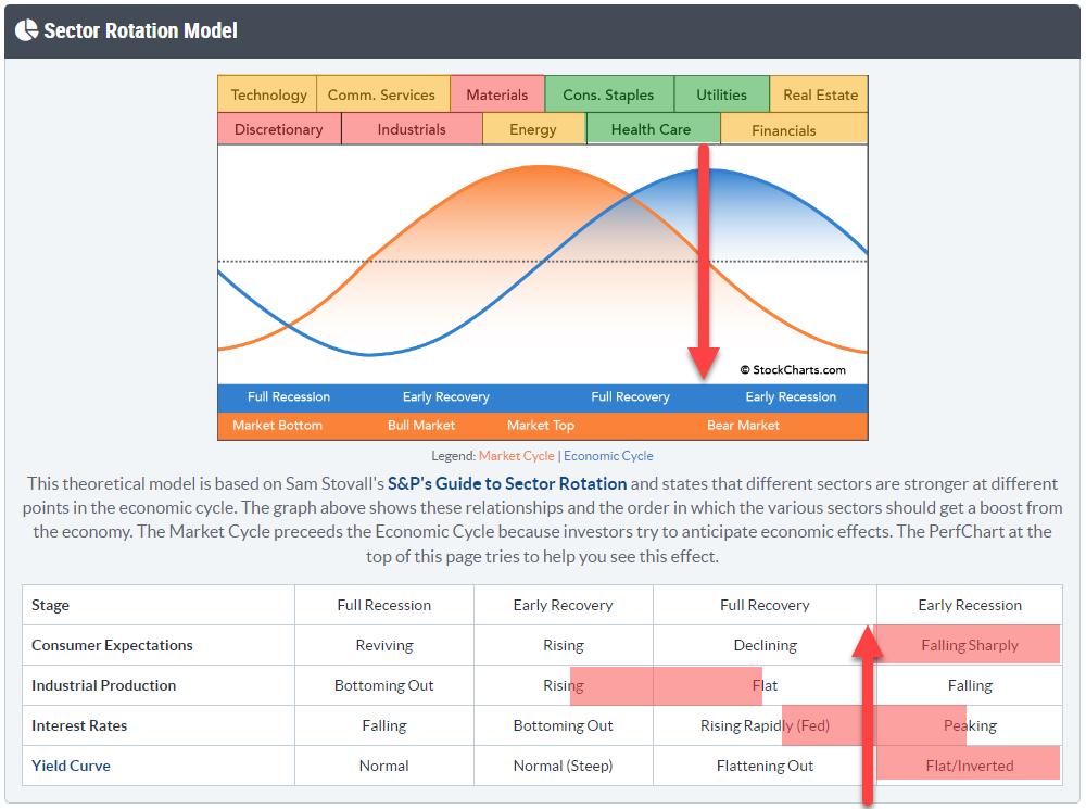
The sector rotation model uses the theoretical sequence of an economy moving through the various stages. Starting in a full recession, then moving into an early recovery which evolves into a full recovery, and then dives back into an early recession and later a fuller recession again.
This process is often also referenced as expanding or contracting economies.
It is pretty much an accepted fact that the stock market is leading the economy by a significant amount of time. Estimates are in the range of 6-9 months.
We also know which sectors of the stock market are doing well during various phases of the economy. Hence the idea behind tracking the sector rotation model is that “If we can find an alignment of the theoretical model and actual sector rotation we can gauge where we currently are in the cycle and try to peek ahead to see what is coming”.
The top image with the sectors across the top of the two sine waves that represent the economy and the stock market is very well known and widely used. What is less often used or referred to is the table below that graph, which I think is essential in the interpretation of the sector rotation part.
The table lists four macroeconomic factors that are important to gauge where the economy is at the moment and where it should be heading according to the theory. Obviously, the moves in that table are much slower and much longer-term orientated than the sector rotation as it continues to evolve from day to day or week to week.
Being able to bring those data into the equation enables us to make a better judgment on the current phase of the economy and “read” the current sector rotation in that light which can be helpful in assessing what may lie ahead of us.
So at the moment, three out of the four macro factors are pointing to the economy being somewhere between full recovery and early recession, probably leaning more towards the early recession phase.
I was/am a bit puzzled on how out of whack that Industrial production reading is at the moment but I received a mail from a user who suggested:
“We have an oversupply in every area right now so perhaps the factories were just running off those previous signals which were nothing more than amplified slingshots from PM who got it wrong on orders after the covid reaction post shut down?”
And it kinda makes sense to me. If we follow that assumption Industrial Production should rapidly move further ahead and catch up with the other factors and move into or towards recession territory.
Seasonality
This is a different kind of animal but my approach here is along the same lines as with the sector rotation model.
Seasonality is a tool, a phenomenon, that is around for a long time in stock market analysis. The saying “Sell in May but remember to come back in September” is totally based on the seasonal behavior of the market.
Stockcharts.com has a great tool to assess seasonality.
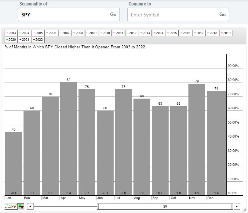
You can enter any symbol in the database and the graph will show you the percentage of time (months) over the period of your choice (max 20 years) in which the symbol closed higher than it opened for each month. The figure at the bottom of the bars shows the average percentage gain/loss over the chosen period.
This will already give you a pretty good idea of the general behavior of a symbol throughout the year.
However, as you know, using Relative Rotation Graphs and Relative Strength, in general, is all about over- and under-performance.
The seasonality tool on the site will also help you with this. When you enter the symbol for a sector like XLY in the left box and a comparative symbol, like SPY, in the right box, you will get the same information but now calculated based on the comparison of these two symbols.
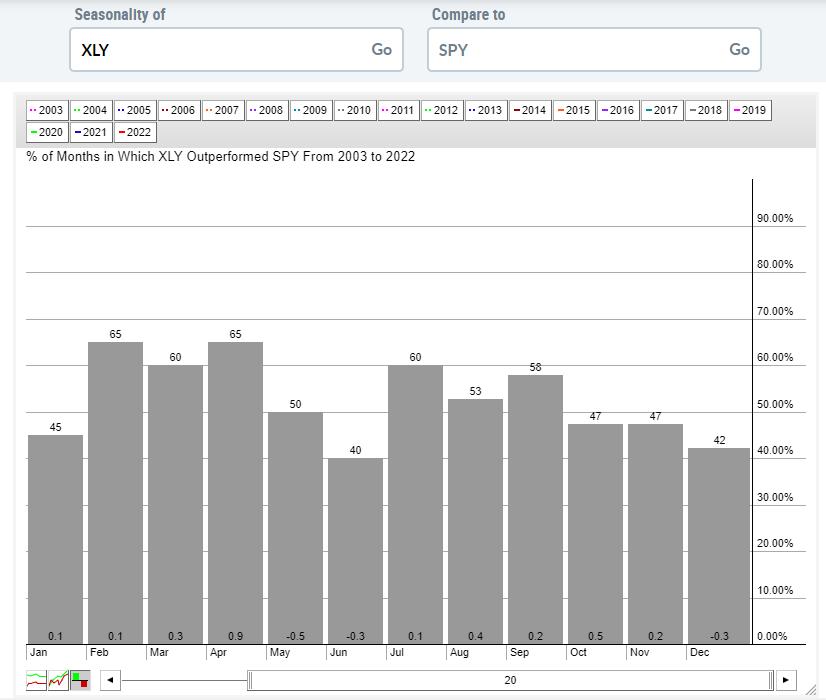
This approach will help you to gauge which symbols/sectors in our use case, are generally over- or under-performing during which period sd of the year and by how much.
The spreadsheet that I often use in Sector Spotlight uses the data from the seasonality tool on the site and plots them in 3D for all sectors throughout the year.
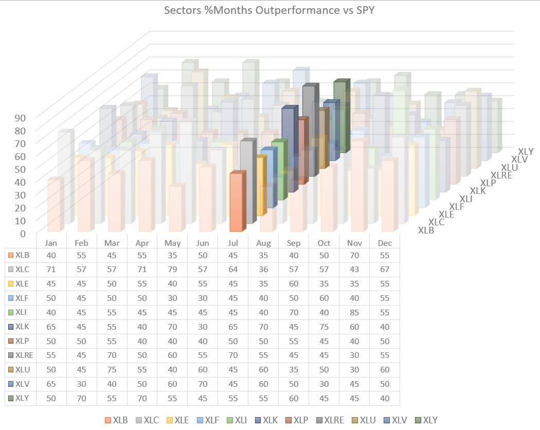
In order to better see the data for the upcoming month, I usually highlight that month to make it stand out.
An alternative way to see all data and highlight the interesting periods is to shade the cells based on their values.
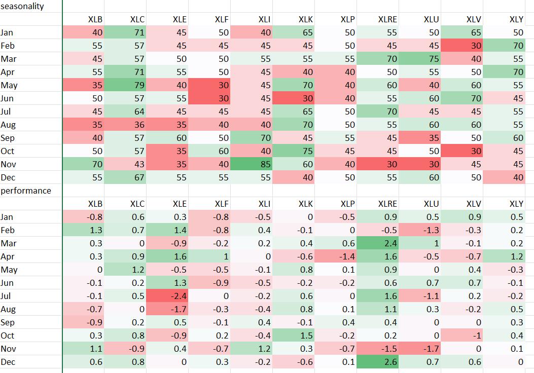
The brighter the color the more interesting the sector/month.
All these data are based on historical values. This is what happened in the past. What I am trying to do is to see if I can see an alignment of the current rotation for sectors with what we could expect from the theoretical (average historical) performances.
When the current rotation is nowhere near what happened in the past, I stay away from any assessment. But when the current rotation aligns to a large degree with the historical seasonal pattern I feel the odds may be in our favor. Especially when the final check of the price chart agrees and supports a move as expected from the seasonal pattern I’m happy to make a call and go with that.
I hope this answers any potential confusion with regard to the differences between the two approaches and how they can be used to our advantage. Please keep your questions coming, they make for great articles which are of interest to at least one reader 😉
#StaySafe, –Julius