 Relative Rotation Graphs are not only good for showing you the relative rotation based on price but they can also help you to see the relative development (rotation) of breadth on a sector level.
There are many measures for breadth available in the Stockcharts.com database including several breadth indexes that are calculated at sector level.
Breadth, in general, is used to gauge the level of participation of individual stocks in an advance or decline in the markets. One example is the number/percentage of stocks trading above their n-day moving average. For the S&P500, the ticker symbol that measures the percentage of stocks that are trading above their 200-day moving average is !GT200SPX.
Simply put, when that measure shows high readings it tells you that a market rally is broad based. A lot of stocks in the S&P 500 are participating in the rise of the S&P. At the moment, that metric is at 50.6%. So half of the stocks are above their 200-day line and the other half is below it.
Stockcharts.com also maintains this index for 20-day MA and 50-day MA. Basically you can measure breadth for short- (20-day), medium- (50-day), and long-term (200-day) trends.
If you go into the symbol catalog and search for <!GT50> you will get all indexes for which Stockcharts maintains this index looking at stocks above their 50-day MA.
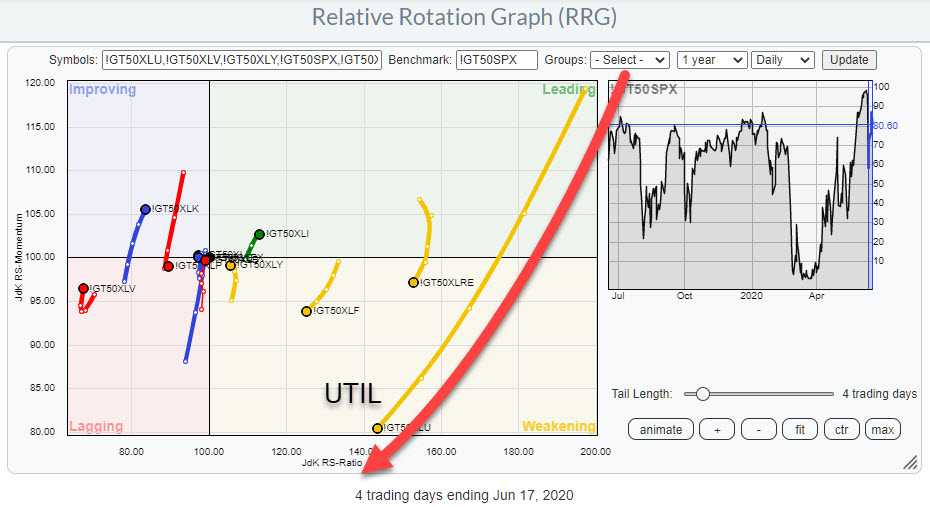
In this list you will also find this metric calculated for all of the 11 sectors that make up the S&P500. The RRG at the top of this article shows the rotational behavior for the breadth (50-day MA) of all sectors using the breadth for $SPX as the benchmark.
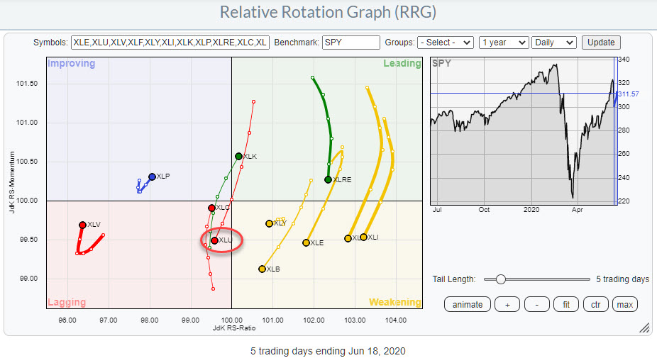
What I am looking for on an RRG like this is (strong) confirmation or negation of the moves that are underway on the regular, price based RRG as printed below.
Here we find XLU inside the lagging quadrant after a brief rotation through leading and then an almost straight rotation through the center of the graph with a decent tail length which can be used as a measure of momentum for the move that is underway.
The long tail for 50-day breadth coming down from the leading quadrant into weakening perfectly confirms the ongoing weakness that is visible on the price RRG.
Plotted on a regular chart it looks like this:
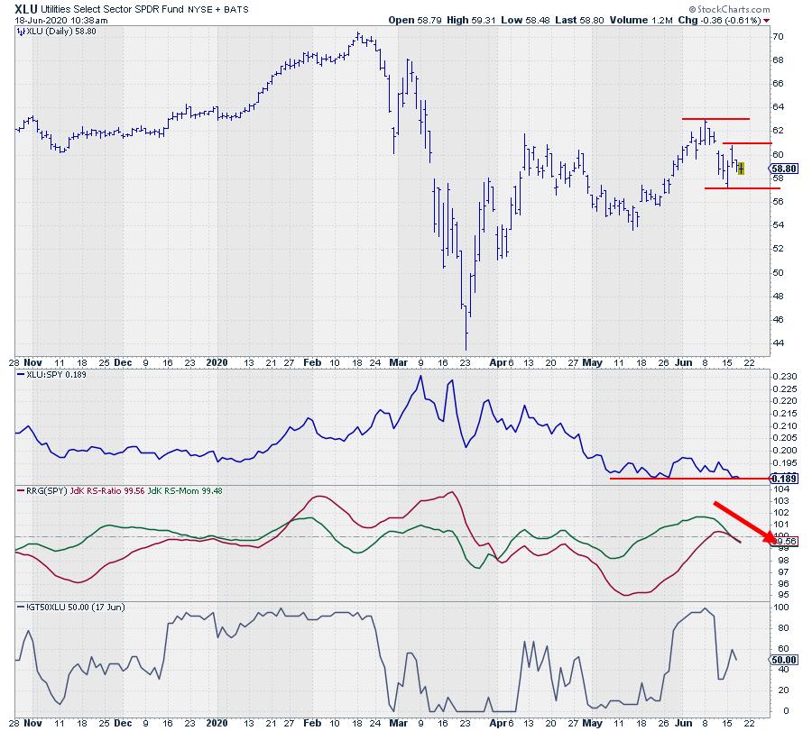
On the price chart it looks as if XLU has closed its gap two days ago and formed a new (lower) high. I am now watching for a break below the $57.10 low and an acceleration after such a break.
Very likely such a break lower in price will also cause the RS-Line to break below the horizontal support level where it is now hovering.
The RRG-Lines are already pointing sharply lower and the 50-day breadth is heading lower, now at 50%. As we saw on the RRG chart this is weaker than the 50-day breadth for $SPX which is currently around 80%
All in all this leads to the judgement that XLU is set for a further deterioration vs $SPX.
#StaySafe, –Julius
My regular blog is the RRG Charts blog. If you would like to receive a notification when a new article is published there, simply “Subscribe” with your email address.