I love getting email from my readers and this particular email was great. He felt like he was asking a ridiculous question, but it is a common one that I don’t think is asked out loud. This reader asked the question in the context of my DP Diamonds Report wherein I include both the daily and weekly charts for each of my stock picks.
“You show two charts per equity, one daily and one weekly so what is the significance of a daily chart over the weekly?”
When I research a stock or ETF for possible purchase there are few things that I find critical. First is looking at price charts from monthly to daily to minute/hour. Why should I care about a monthly or weekly chart if I’m in it for a short-term trade? I believe it is important to glance at those longer-term charts to find any possible support or resistance areas that go waaaay back in time. If they coincide with near-term support/resistance on a daily chart, it can be considered more “touches” to those support or resistance lines which increases the ‘strength’ of that price level. Let’s look at an example.
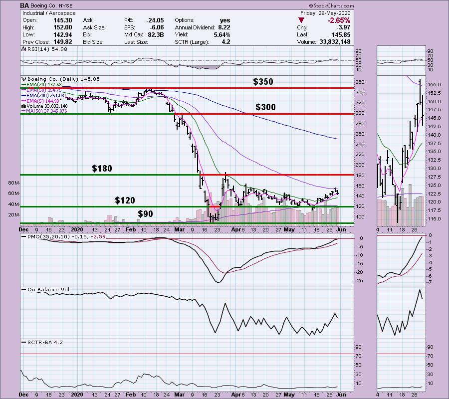
Below is Boeing (BA). I’ve annotated five levels of support and resistance and labeled the price. We can see on the daily chart these are important areas of support/resistance. However, we can only see one year…
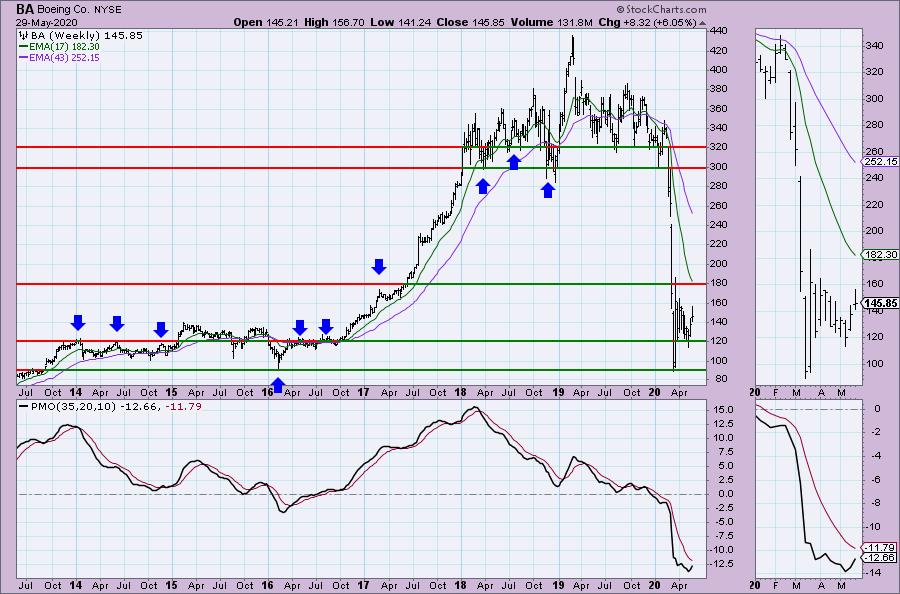
Look at these same price levels on the weekly chart. Notice we can add more “touches” to some of those levels.
Can we add any more on a monthly chart? A little bit. Mainly we can see that the basing area for BA is $25 – $80.
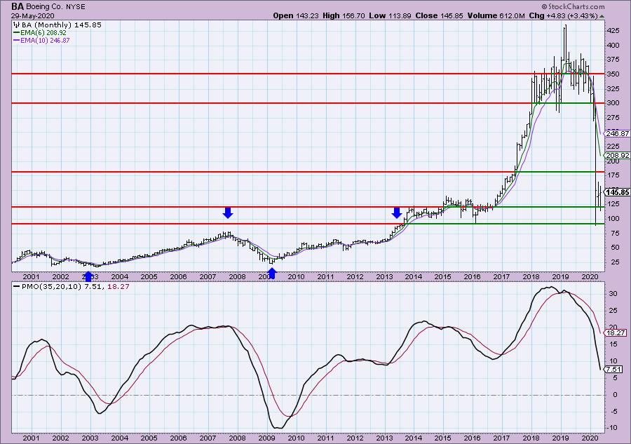
Conclusion: Many stocks have what appears to be “memory”. Well, the investors have memory. They remember the key levels they purchased and sold at. I find it important to know whether a particular support or resistance level has ‘history’. If it does, I know that there is a good chance those support or resistance levels will hold more tightly and could be areas to look for key reversals.

As investors, we want to accomplish two basic things: (1) Determine the trend and condition of the market and (2) select stocks that will ride that tide. The DecisionPoint Alert helps with the first step, and DecisionPoint Diamonds helps with the second. Go to DecisionPoint.com and SUBSCRIBE TODAY! (Charter Subscriber Discounts Available!
Conclusion: It’s important to follow a very short-term chart (5/10/15-minute) and watch the indicators to pinpoint possible key reversal points. Many people don’t realize that the PMO can be used on very short-term charts and still provide the important information you need to trade. The RSI is an excellent companion to confirm price action and the PMO.
If you’d like a trial to our website newsletters, contact support@decisionpoint.com and we will hook you up!
Happy Charting!
– Erin
Diamond of the Week (from Wednesday 5/27 DP Diamonds Report):
Below is the original article but the charts have been updated through today.
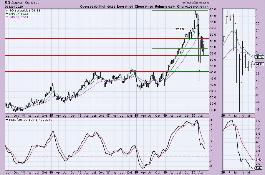
Southern Co (SO) – Earnings: 7/29/2020 (BMO)
The Southern Co. is a holding company. The firm engages in the sale of electricity. It operates through the following segments: Traditional Electric Operating Companies, Southern Power and Southern Company Gas. The Traditional Electric Operating Companies segment refers to vertically integrated utilities that own generation, transmission and distribution facilities, and supplies electric services in the states of Alabama, Georgia, Florida, and Mississippi. The Southern Power segment constructs, acquires, owns, and manages generation assets such as renewable energy projects and sells electricity in the wholesale market. The Southern Company Gas segment distributes natural gas through natural gas distribution facilities in the states of Illinois, Georgia, Virginia, New Jersey, Florida, Tennessee, and Maryland.
(Note: The breakout from the falling wedge had not happened as of 5/26.)
I used to own this stock and I’m considering reentering. There is a bullish falling wedge, but it hasn’t executed yet. I might consider getting in before that breakout given price traded completely above the 20-EMA. This has a great dividend and yield as well. The SCTR is a bit of a problem given it is declining. The OBV has a lovely positive divergence that I don’t think has completely played out on this rally.
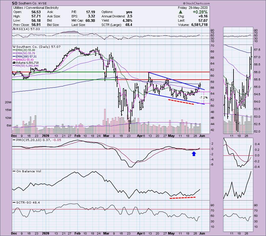
The PMO seems to be decelerating. Of course, I did look and this was a Diamond on April 9th. The weekly PMO was rising at the time and it didn’t do much at all. I prefer a better weekly chart, but for a short-term trade it could be good.
Technical Analysis is a windsock, not a crystal ball.
Helpful DecisionPoint Links:
DecisionPoint Alert Chart List
DecisionPoint Golden Cross/Silver Cross Index Chart List
DecisionPoint Sector Chart List
Price Momentum Oscillator (PMO)
Swenlin Trading Oscillators (STO-B and STO-V)