One of my early mentors, Ralph Acampora, suggested that, if you want to understand the trend in the S&P 500, you simply need to look at the chart of the S&P 500. What is the trend? Are we seeing higher highs or lower lows? Where are we at relative to important support and resistance levels? Are key moving averages sloping up or down?
That message stuck with me, to the point that the first chart I look at every day is a weekly chart of the S&P 500. The second chart is a daily chart of the S&P 500. Every day, same two charts.
Over time, I’ve added to these two charts with additional visuals covering other market indexes, measures of market breadth and sentiment, and the performance of key themes and groups using a series of price ratios. Most of these charts are included in my Mindful Investor Live ChartList. A couple times a year, I combine some of the most compelling data series into one chart, which I simply call “The Chart”. The idea is that all I should need to get a read on the current market trajectory is to watch The Chart.
Are these indicators trending bullish or bearish?
When do we know when a market bottom has occurred? Join me for my upcoming FREE webcast, The Market Bottom Checklist, where we’ll review previous bear market cycles and develop a bear market checklist to use in 2022! Sign up for this free event HERE.
Here’s my latest version of The Chart, what each data series represents and what it’s telling me about the current market environment.
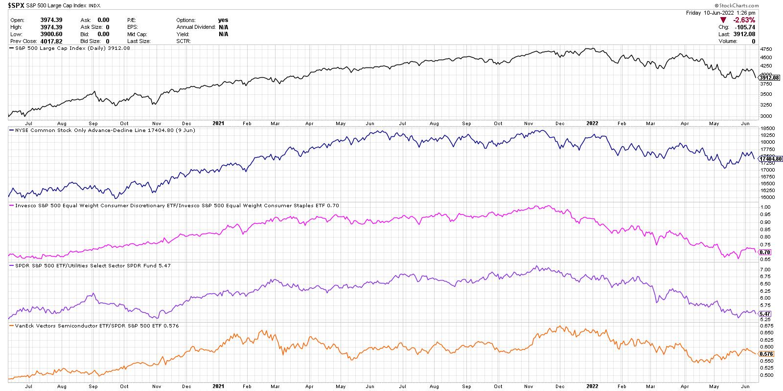
From the top, we’re looking at the daily closing price of the S&P 500, the NYSE common-stock-only advance-decline line, the equal-weighted ratio of the Consumer Discretionary to Consumer Staples, the S&P 500 relative to the Utilities sector and the relative performance of the semiconductor group.
The daily closing price of the S&P 500 is simplicity in itself. Is the trend bullish or bearish? Now how you answer that question certainly depends on your time frame, but, using two years of daily data, I’m generally trying look forward about 1-3 months. Since the beginning of 2022, the S&P has been making a fairly consistent pattern of lower highs and lows. Downtrend.
Next, we have market breadth in the form of the NYSE advance-decline line. How many stocks are closing higher than yesterday, and how many are closing lower? We take this net difference every day and add it to a running total, thus a cumulative measure of market breadth. Similar to the S&P 500 chart, the A-D line has pounding out a fairly consistent downtrend of lower highs and lower lows. Bearish.
Third, we’re looking at what I call the Offense vs. Defensive ratio. Within the consumer space, are investors rotating more to the offense of Consumer Discretionary (things you want) or the defense of Consumer Staples (things you need)? This key ratio actually topped out in November, just as the Nasdaq Composite index did. Basically, investors have been getting more defensive since the fourth quarter of 2021. Bearish.
Next, we have relative performance of the Utilities sector, but plotted inversely to match the overall trend in the markets. Utilities usually only outperform when the markets are challenging and investors are getting defensively positioned. Just as with the Offense vs. Defense ratio, this data series has been trending downward since November 2021. Bearish.
Finally, we are looking at the relative performance of semiconductors. I consider semis a bellwether group, in that these names tend to do well when economic conditions are strong and tend to struggle when consumers are buying less products fueled by their technology. This last series is the only one I could perhaps label as “neutral”, in that it has not made a new low since April. Semiconductor names have bounced off their lows and in the short-term have been trending higher. Neutral.
So my current version of The Chart shows four bearish indications and one neutral. When the indicators on this chart turn from bearish to neutral, and then neutral to bullish, you will hear me take a much more constructive tone for stocks. Until then, the path of least resistance remains lower.
RR#6,
Dave
P.S. Ready to upgrade your investment process? Check out my YouTube channel!
David Keller, CMT
Chief Market Strategist
StockCharts.com
Disclaimer: This blog is for educational purposes only and should not be construed as financial advice. The ideas and strategies should never be used without first assessing your own personal and financial situation, or without consulting a financial professional.
The author does not have a position in mentioned securities at the time of publication. Any opinions expressed herein are solely those of the author, and do not in any way represent the views or opinions of any other person or entity.