There’s been a lot of talk and articles on rates, rising yields, and rate hikes lately. That seems like a good moment for a reminder of the fact that Relative Rotation Graphs can also be very well used to visualize the (relative) movement of yields for various maturities.
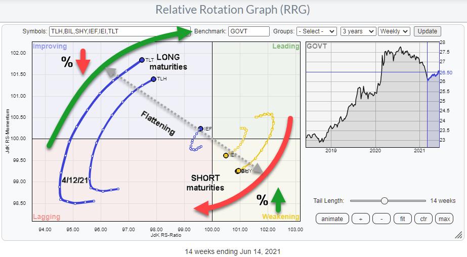
In the drop-down box for pre-defined groups, there are two entries related to US bonds/yields. The first one is labeled “US Bond Maturities” and, when loaded, will show you the RRG at the top of the article. In this group are all ETFs that represent bond “prices” corresponding with various maturities of the US Government bond market.
The second entry printed below is labeled “US Yield Curve”.
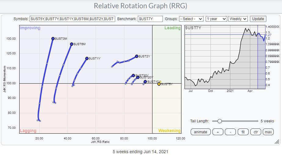
This RRG shows the rotation for the Yields on various maturity bonds. In essence, this is the same picture as the first one holding the ETFs, but reversed. As you know, bond prices and bond yields move inversely vs. each other. That’s the only thing you need to keep in mind when analyzing these RRGs.
Personally, I prefer the bond version, showing the rotation of the ETFs, I think it rotates more clearly and paints a better picture of what’s going on in that area of the market. Also, it resonates better with me, as the leading quadrant means good/strength. Prices are going up and yields are going down, which generally is perceived as being a good thing. And the lagging quadrant represents falling prices and rising yields.
I have spoken to people who prefer the yield-based version, so we added it as an option to the list of pre-defined groups. As long as you realize what you are looking at, it is all good.
One way I like to use the yield-based version sometimes is by changing the benchmark to $ONE. That allows me to see whether yields in general are moving up or down. Especially when you load this RRG with 10 years of historical data, set the scaling to max, and then hit the animate button.
Most of the time, all tails will move in tandem and remain close together. When you see tails moving away from the cluster or you see one cluster moving in one direction and one cluster in the other, something odd is going on that may require a bit more of our attention.
Flattening and Steepening
The RRG at the top of the article is a great way to keep a handle on the steepening and flattening of the curve. If you need to read up on what that is or refresh your memory, there is a great article in ChartSchool that will help you get up to speed.
Since late 2019, after a short inversion, the 10-2 yield curve has been steepening rapidly.
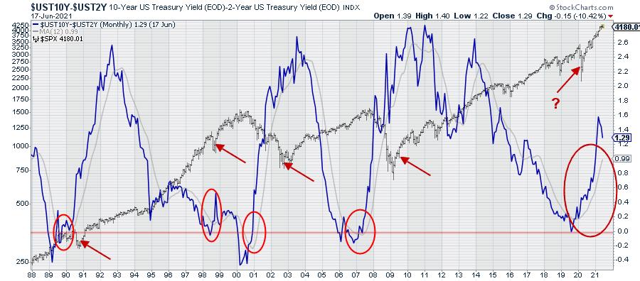
The chart above shows that 10-2 yield curve relationship in combination with the S&P 500. Very recently, the yield curve started to flatten again, albeit slowly. And that rotation was picked up, in the week of 4/12, by the RRG at the top of the article shortly after the peak on 3/15.
Looking back in history on the graph above, all previous prolonged periods of yield curve steepening moved up towards the 2.5% region (10-year yields 2.5% above 2-year yields). Be careful, as that says nothing about the absolute level of yields and whether that is higher or lower than current levels.
Yields Moving Higher?
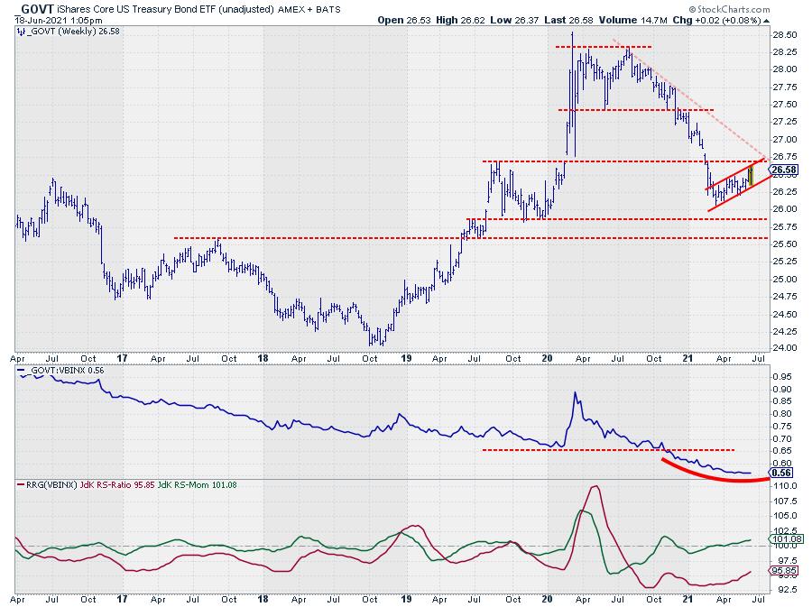
GOVT is an ETF that provides exposure to US Treasuries from 1-30 year maturities. So the direction of GOVT identifies the general direction of the broader US Government bond market.
Looking at the chart above, we can identify a large double top formation that was completed when GOVT broke below $27.50, which is the low that was set in June 2020. Following that break, the decline in price (rise in yields) started to accelerate and only managed to come to a rest and set a low in March of this year.
Since that low, GOVT is crawling upward, showing a short series of higher highs and higher lows in what looks like a bearish flag formation. Based on the duration of that counter-trend move, it does not qualify as a flag (anymore), but I am still judging it as a counter-trend move. It is the first meaningful rise after the peak in August 2020 at $28.30, and I expect this move to run into trouble (=resistance) very soon.
In the area around $27.75, there is horizontal resistance from the August 2019 peak, which clusters with the rising resistance line marking the upper boundary of the counter-trend rally. Breaking down from that recovery move will very likely cause a renewed acceleration of the decline in GOVT and push yields higher across the board.
Given the slope of the steepening of the curve and the observation that it has plenty of upside room to move further, I am going to watch for a rotation of longer maturity ETFs into a weak RRG-Heading and for shorter maturities to turn into a strong RRG-Heading. This will signal a continuation of the steepening, which is the prevailing long-term trend.
Historically, the stock market has always gone through a serious decline somewhere during a period of steepening of the curve. The question mark on the chart indicates that it is unclear for me whether or not the dip in 2020 was THE decline that was to be expected during the steepening phase. Will we see another, more serious, one?
The developments in the bond market, combined with current sector rotation and the price developments on the S&P chart, are pointing to weakness ahead. We will have to wait and see how far, how deep and how long this will go, but caution is warranted, IMHO.
#StaySafe and have a great weekend, –Julius
My regular blog is the RRG Charts blog. If you would like to receive a notification when a new article is published there, simply “Subscribe” with your email address.