When I’m prioritizing information to help me understand the broad market environment, I tend to consider this as the order of importance:
- Price
- Breadth
- Sentiment
I’ve found sentiment readings such as the American Association of Individual Investors (AAII) and Investors Intelligence (II) surveys to be helpful as a way to get inside other investors’ heads. What are they thinking? How are they positioned?
While I would never design a trading system based off of something like survey results or magazine covers (another fantastic way to gauge social mood!), I find sentiment data like this can help you consider what questions you should be asking as an analyst.
Two sentiment reads that I regularly follow are the NAAIM Exposure Index and the Rydex Ratio. Let’s review the charts and see how these indicators are near positive extremes.
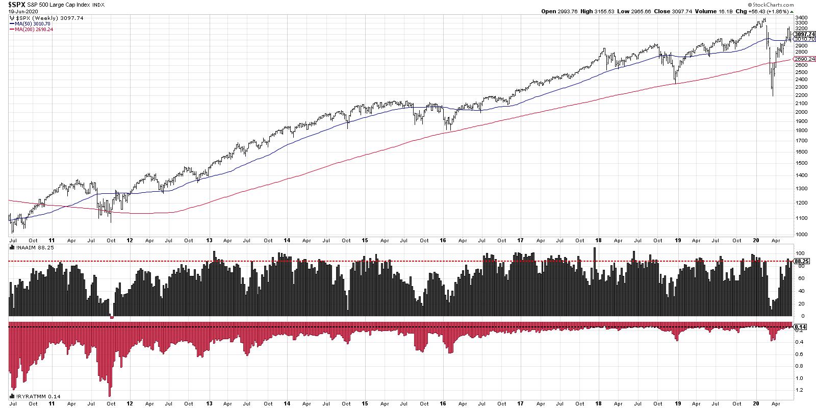
The NAAIM Exposure Index tracks positioning by active money managers. What percent have they currently allocated to equities? NAAIM insists that this is not a forward-looking indicator, moreso reflects historical positioning. Even so, I can’t help but notice that allocations tend to be quite high around bull market tops and low around bear market bottoms!
Here’s the catch. In extended bull markets (say 2013-2015) the exposure will remain very high (at times over 100%). But you have to remember that this indicator should not be used as a way to determine whether we’re in a secular bull or bear cycle! That’s done with an analysis of price. What this indicator does tell you is how exposed active managers are to market downturns. Knowing that investors are positioned in a bullish allocation, and are therefore vulnerable to a market downturn? That has value to me.
As of the end of this week, the NAAIM Exposure Index sits at 88.25, which is certainly in the upper range of potential values. Conclusion: active managers are heavily allocated to equities.
The second sentiment indicator I’m showing the Rydex Ratio, which basically compares assets in the bearish and money market funds in the Rydex family versus the bullish and sector funds. To put it another way, are investors allocated more to the bullish or bearish end of the Rydex family of funds?
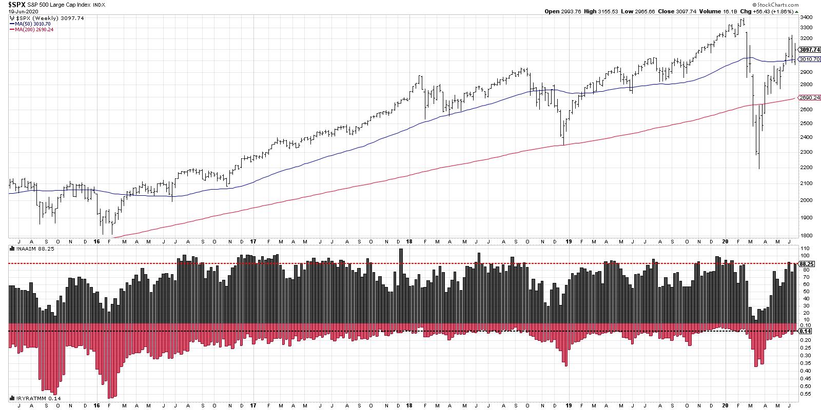
Here, I’ve plotted the indicator inversely, so the results line up more with the NAAIM Exposure Index. Higher on the chart means a bullish positioning, while lower on the chart represents a bearish extreme.
We can see the the Rydex Ratio is at an extremely bullish reading, similar to where it’s been in late stages of cyclical bull markets in late 2017, early 2019 and late 2019. Some of these occurrences saw relative brief pullbacks, while other times it was more significant. But, similar to the NAAIM index, it shows that investors are positioned very heavily on one side of the ledger.
My goal with sentiment indicators is to try and get inside the head of all the investors out there, which, to be honest, is similar to what I try to do with price! Sentiment tells you what people are thinking and how they are positioned. Price tells you how the emotional state of investors is affecting the supply/demand picture over time.
Here, we can we see that two popular sentiment readings are at the upper end of the bullish extreme, which suggests to me that investors are positioned in a way in which a market downturn would cause maximum pain.
RR#6,
Dave
David Keller, CMT
Chief Market Strategist
StockCharts.com
Disclaimer: This blog is for educational purposes only and should not be construed as financial advice. The ideas and strategies should never be used without first assessing your own personal and financial situation, or without consulting a financial professional.
The author does not have a position in mentioned securities at the time of publication. Any opinions expressed herein are solely those of the author, and do not in any way represent the views or opinions of any other person or entity.