When you look into a technician’s “tool kit”, you’ll likely find a divergence analysis. Generally speaking, any time you have higher prices and lower (fill in the blank) or lower prices and higher (fill in the blank), there’s either a negative divergence or positive divergence, respectively. Most technicians have a hierarchy of technical analysis tools. I have divergences as part of my tool kit, but they rank somewhere in the “upper-middle” of importance and I’ll explain why in Part 2 of this two-part series. They send out so many false signals, it’s one reason why technical analysis gets a bad rap. Those who argue against technical analysis will point out those false signals, because they simply want to disprove that technical analysis works. For me, technical analysis is a way to measure risk, which I believe it does beautifully. But it does not work 100% of the time – not even close. If you set the technical bar too high, then technical analysis will frequently fall short of your expectations.
Technical analysis provides us signals in many shapes and forms. Many times, I feel it’s the equivalent of putting together a 10,000 piece jigsaw puzzle with 200 pieces missing. Once you put it together, you can visualize it despite the missing pieces. But if you don’t put together the pieces you have, you can’t see the picture at all. It’s a jumbled mess of individual pieces that provide you absolutely nothing. Those who oppose technical analysis try to put two pieces together, and when they realize they don’t fit, they judge the entire puzzle as a waste of time.
Folks, it’s not a waste of time. Honestly, without technical analysis, I’d go crazy with all the disinformation that is routinely disseminated in the media. In writing my ChartWatchers article this weekend, I discussed the Dow Theory. One piece of that theory relates to the fact that the market reflects all available information. Current price reflects all known information. While I believe the Big Picture reflects a secular bull market, one where we’ll see much higher prices over time and in the years to come, we should expect “secondary movements” (a Dow Theory component) in the market that from time-to-time will move opposite the “primary movement”, or the secular bull market that we’re enjoying.
One of the culprits of “secondary movements” is slowing momentum. When you hop in your car and drive for 10 hours on a long trip, you have to stop periodically to refuel. You’ll simply run out of gas if you don’t. That temporarily alters your trip, but you don’t turn around and go home or leave your car parked on the side of the road. You stop, get gas, and then the trip continues after stalling temporarily. That’s how primary trends in the stock market work. Sometimes – just like the gas light on your car’s instrument panel – we see warnings of a possible need to pause. While these warnings can come up in different types, shapes, and sizes, I’m going to focus on divergences, or slowing momentum, as that “gas light” warning on the chart.
What is a Divergence?
As mentioned above, in technical analysis, when price moves in one direction while an indicator (usually momentum) moves in the opposite direction, a divergence occurs. My primary momentum oscillator is the PPO, so I’ll use this in my illustration. But it’s often times used in connection with RSI and Stochastics, although the latter makes little sense to me. Stochastics will regularly approach its maximum reading – 100 – during a significant price advance. When prices later move higher, how can Stochastics go higher? A negative divergence will emerge, but there’s no other choice. It’s a given. That’s why I NEVER use Stochastics as a signal for divergences. They make no sense to me. It’s a personal choice. I would rely on RSI divergences only slightly more. Again, they’re bound by 100. If an RSI reaches even 80 or 85, it’s very, very difficult to pierce that level, so the next high will almost assuredly print a negative divergence. Again, that’s not my style. So my personal preference is the PPO, which theoretically is not bounded. I do have a rule of thumb, however. When PPOs move above 10 (this represents that the short-term 12 period EMA has risen 10% above the longer-term 26 period EMA), I find that it’s many times difficult on the next price high to eclipse that prior high. So I tend to ignore PPO divergences that form after initial price highs send the PPO above 10.
Before I discuss some of the fallacies of divergences in part two of this series, let me first illustrate a clear-cut divergence on Starbucks (this one is a series of negative divergences – higher prices, lower PPOs):
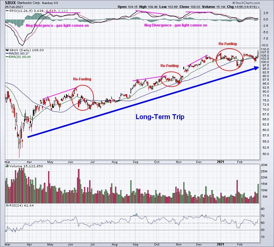
The long-term buy and holder should pay no attention to divergences on a daily chart. You’re on a plane and can make the trip without refueling. Pull the shades down, relax, and get a little “shut eye”. But these warnings are extremely important to a short-term trader that doesn’t want to tie up capital for weeks while their positions refuel.
Now here’s the bad news. When I look back at divergences on a chart, I know EXACTLY where to draw the lines. In terms of Monday morning quarterbacking, divergences work 100% of the time. In my next article on divergences, I’ll highlight the fallacies of divergences – and spotting those can be a life saver as a trader.
In my next article, I’ll discuss divergences and what I look for….or don’t look for. Stay tuned!
Also be sure to scroll down and subscribe (green button) to my Trading Places blog so that you never miss an article. Once you’re subscribed, my TP blog articles will be emailed to you as soon as they’re published. It’s a great feature here at StockCharts.com.
Finally, if you’d like to join our growing list of EB Digest (free newsletter) subscribers, you can enter your name and email address HERE. In upcoming issues, I’ll be focusing on companies poised to take advantage of a strengthening economy throughout 2021. Please join our community!
Happy trading!
Tom