Correlation is a useful metric to use when trying to gauge the direction of the market.
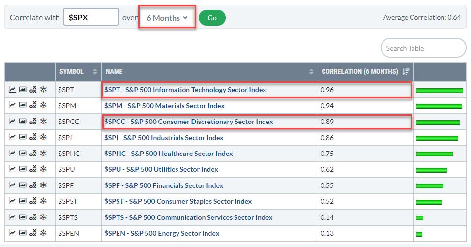
The table above shows the correlations for the 12 sectors against the S&P 500. In this version, I used a 6month period to calculate the correlation, the drop-down selection allows users to look at correlations over different time periods.
When you do that you will notice that the Technology Sector and the Consumer Discretionary sector are always at the top of the list. Some sectors, like Energy, Communication Services, Consumer Staples, will show up at different positions as their correlations show more change over time.
Technology and Discretionary are always very close to 1 (which is “the market”). This can largely be explained by the large weight of both sectors within the S&P 500.
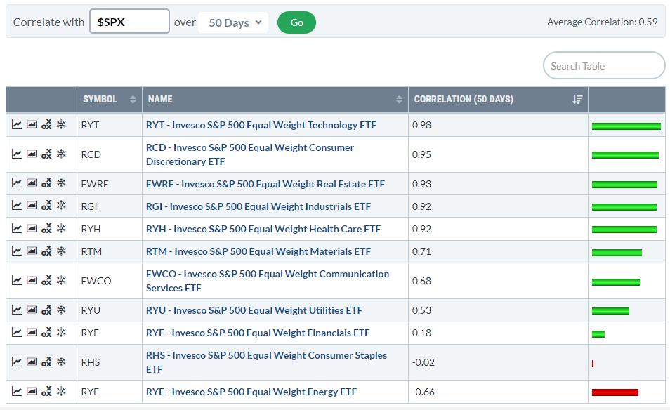
When you run this same table for the Equal Weight Sectors you will see similar levels of correlation against the S&P 500.
However, when you run the EW sectors against, their own, Equal-weight S&P 500 the ranking changes.
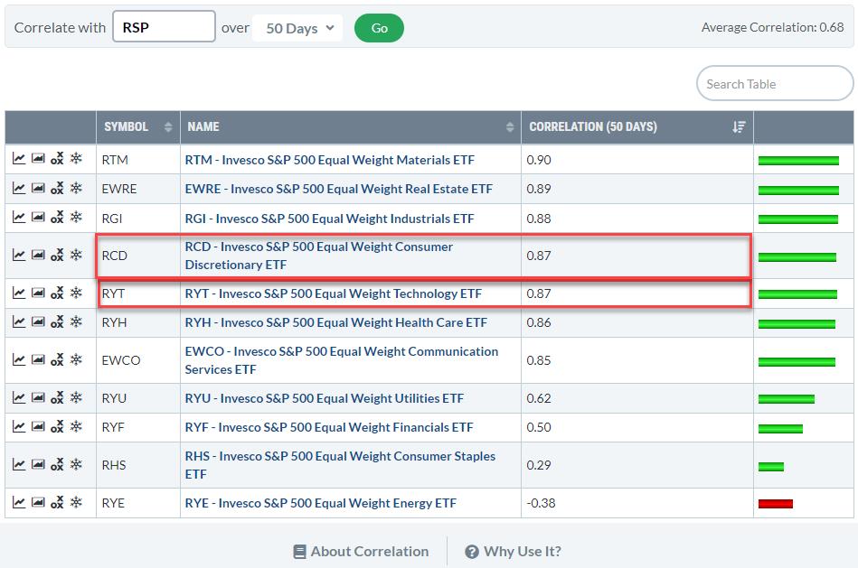
Now Tech and Discretionary are no longer at the top of the list. They are still high but much more in line with other sectors.
Here you can see that the difference in correlation between the first seven sectors is about 5 basis points. Only from Utilities downward the correlation really drops and Energy is even significantly below 0.
As a result of the high correlation, the direction of the two biggest sectors Technology and Discretionary is crucial for the direction of the S&P 500. Or the other way around; as a result of their heavy weight inside the S&P 500, the correlation of Tech and Discretionary with the S&P is very high.
Either way, keeping a close eye on the charts for these two sectors will help us to determine what might be in store for the market as a whole ($SPX).
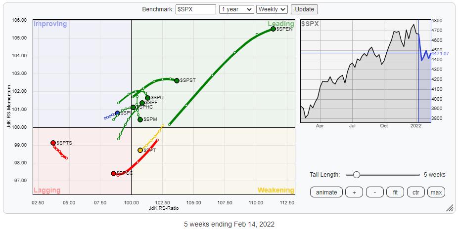
The RRG shows the rotations for the sectors vs $SPX. This RRG uses the actual underlying indexes instead of the SPDR ETFs which we usually use. Not surprisingly the rotational patterns are exactly the same.
The weak rotations for Technology and Discretionary are clearly visible.
Technology is still inside the weakening quadrant and heading lower on both axes towards lagging. Consumer Discretionary already inside lagging and since last week, leveling off a bit on the RS-Momentum scale.
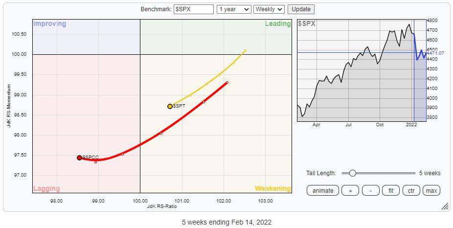
Technology (27%) and Discretionary (13%) together make up 40% of the total market capitalization of the S&P500. So when these two sectors are pulling negatively on the S&P 500, a lot of sectors (market cap) need to pull the other way to offset these forces.
Technology (XLK)
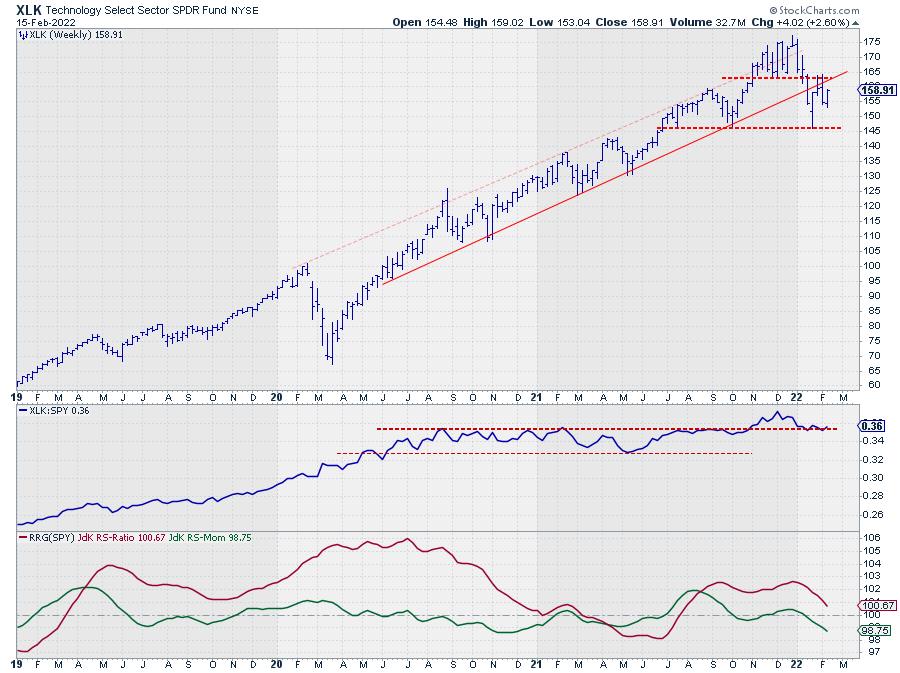
XLK (Technology) left its rising channel five weeks ago to find support at 145. Out of this support level, XLK bounced back towards a double resistance level near 164.
This resistance level is coming off the former support level offered by the low in December. The break below that low completed a top formation, as always old support levels tend to come back as resistance later on. This happened in the weeks starting 1/31 and 2/7 when XLK touched 164 from below.
A similar situation is in play with the former lower boundary of the rising channel. For a long time, this trendline acted as support. Here also, when broken, this former support line tends to come back as resistance. The big difference with a former low is the act that we are dealing with a dynamic level that moves higher over time.
At the moment that former support line is now moving around the same level as the aforementioned December low, creating a double resistance level.
All in all, the upside potential for XLK looks very limited vs a downside risk that stretches at least down to the recent low at 145 but much lower when that gets broken.
Consumer Discretionary (XLY)
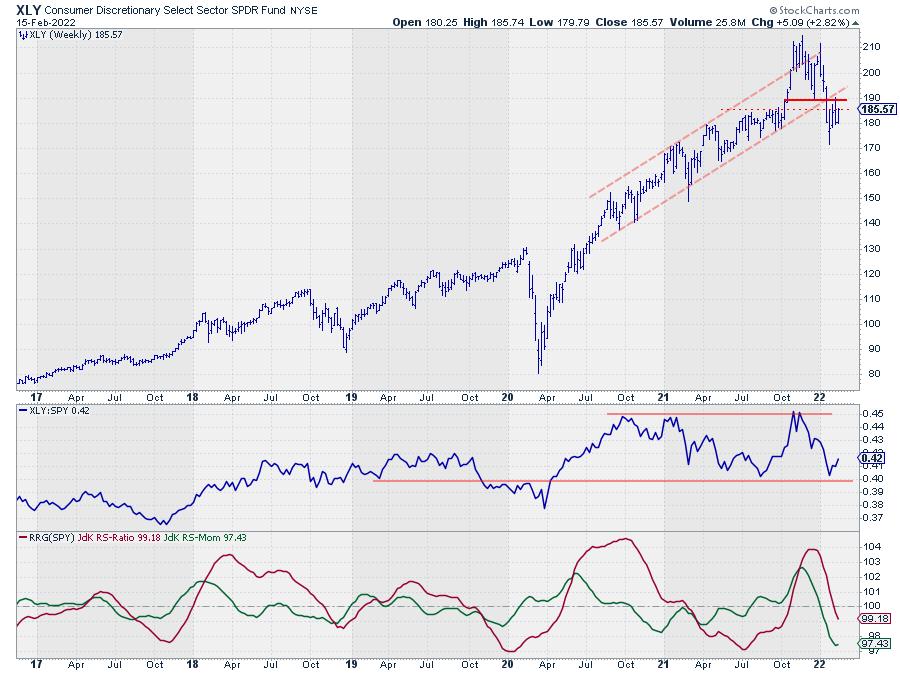
The chart of XLY (Consumer Discretionary) is showing a very similar picture. A break below a former low which completed a topping formation, followed by a break out of a long-standing rising channel, a move to a new low, and a bounce back to former support which is now acting as resistance.
For XLY, the area around 190 is the area where the former trendline intersects the level of the previous low and therefore an important level to watch as resistance now.
Here also upside potential is very limited for the time being while downside risk is quite significant.
S&P 500 (SPY)
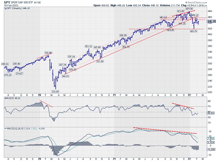
Translating all of that back to the chart of SPY shows a very similar picture. The levels are not as clear as for the individual sectors but the bigger picture is remarkably similar.
The levels I am watching for the SPY are 460 (or better the area between 450-460) to the upside and 420 on the downside.
Bringing in the RSI (9) and the MACD on the weekly S&P chart reveals an ongoing negative divergence between price and both indicators. The initial result of this divergence already surfaced with the drop out of the channel and completing the top formation. As long as this condition remains the market is likely to remain under pressure.
#StaySafe, –Julius