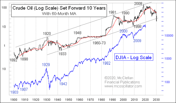
Given the wild price action this year in both the stock and oil markets, I figured it was time to provide an updated of crude oil’s 10-year leading indication for stock prices.
I first discovered this relationship back in 2008, when I looked at a log-scaled long-term chart of crude oil prices and noticed that it looked an awful lot like the chart of the DJIA. So I put the two on a chart together, but was not really satisfied with the way that the pattern details lined up. After some tinkering, I found that offsetting the crude oil plot forward by 10 years made for a much better fit between the two plots.
That was a profound discovery, because it means that the dance steps seen in crude oil’s price plot show up again 10 years later in the stock market. I do not view this as necessarily being a cause-effect relationship. Rather, I view crude oil as the messenger who gets word first about what is coming later for stocks.
It does not always work perfectly. And the stock market’s lag time is not always precisely 10 years. If we can accept those imperfections, we can get a really great messenger about what lies ahead.
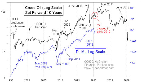
This next chart zooms in closer on just the past few years, to allow us to better see the pattern correlations:

It is worth noting that when a major geopolitical event puts a thumb on the scale for oil prices, the message of the oil market does not necessarily get repeated by the stock market. A great example is 1990, when Iraq invaded Kuwait, causing oil prices to double for a couple of months before dropping back to the low $20s again. Stocks did not mimic that oil price spike, but the rest of the pattern did match up pretty nicely.
Another illustrative exception was the 2008 commodities bubble, which helped push oil prices up briefly to $145, before they came crashing back down into the $30s in January 2009. Stock prices did mimic those dance steps, but with much quieter amplitudes.
Oil prices evidently did not know 10 years ago that we were going to see the Covid Crash in the stock market. We really cannot blame oil prices for not having that information a decade ago. But we can notice that, in early 2010, there was a bit of a soft spot in oil’s uptrend, and we are at the echo point of that now. The Covid Crash just exacerbated the amplitude of that soft spot, and now the Fed’s imposition of QE4 and other liquidity boosting measures are also having an effect on stock prices.
Crude oil prices peaked in April 2011, and then started a long, ugly downtrend. If the stock market is going to continue following oil’s message (as it has been doing for over 120 years, so far), then that should mean THE TOP for stocks is approximately in April 2021. And there should be an ugly decline for stocks in 2024. We still have some time yet before we have to worry about the 2024 decline.
Oil’s price pattern leading up to its April 2011 top suggests that the final surge for the stock market in late 2020 to early 2021 should be a pretty exciting time, for the bulls at least. After April 2021, it is going to be a good time once again to be a market timer, as was the case for the decades of the 1970s and the 1930s.