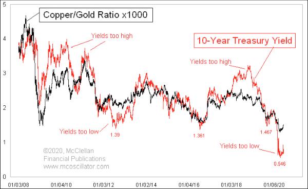
I love intermarket relationships, especially ones which can give useful insights. This week’s chart looks at the ratio of copper prices to gold prices and compares that to the 10-year T-Note yield.
The first interesting point to raise about this comparison is that I am using just a single Y-axis. Normally, a comparison of two data series will merit putting them on separate Y-axes. I did multiply the copper/gold ratio by 1000 to bring it into the same realm as the 10-year yield, and that seems to have been enough of an adjustment.
It is pretty amazing how closely these two plots stick together over time. This chart looks back 12 years, and the relationship has been a sticky one for a lot longer than that.
The additional interesting point is that the 10-year yield plot seems to be the wilder one of the two. While it dances the same dance steps as the copper/gold ratio, it dances farther at the extremes, and that is the fun insight about this comparison. Right now, the 10-year yield has dropped way below the copper/gold ratio on this scaling. When that has happened before, it has conveyed a message that both plots are likely to reverse.
To get the copper/gold ratio to turn upward, copper prices would have to start outperforming gold prices on a relative basis. That typically happens when the economy speeds up and demand for copper improves. Such an improvement in the economy is the Fed’s stated goal in dropping its short-term rates to zero. The copper/gold ratio’s position on the chart says that bond yields have swung too far now.