The Nasdaq charts have some really nice technical patterns for analysis.
Today, I am working through various looks for the Nasdaq in either the QQQ or $NDX. The reason to use QQQ is it is an ETF that can be traded, and it has other pieces of information like the SCTR which is only available on tradeable ticker symbols.
These charts are showing various views as I’ll bounce between the different timelines and displays.
First of all, the quarterly chart is a big long term view of the Nasdaq 100.
This is the lowest RSI since 2012. It doesn’t look very long on the chart but 10 years is a long time. One thing to watch on this chart is that the purple RSI uptrend doesn’t break. I do think that the size of the move down for the first two quarters are suggesting that this time it’s different. The other thing to notice is the big rollover on the PPO momentum indicator.
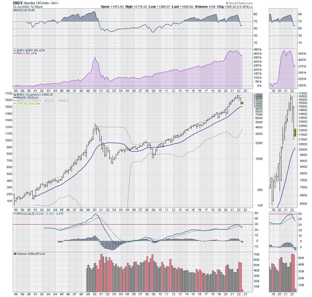
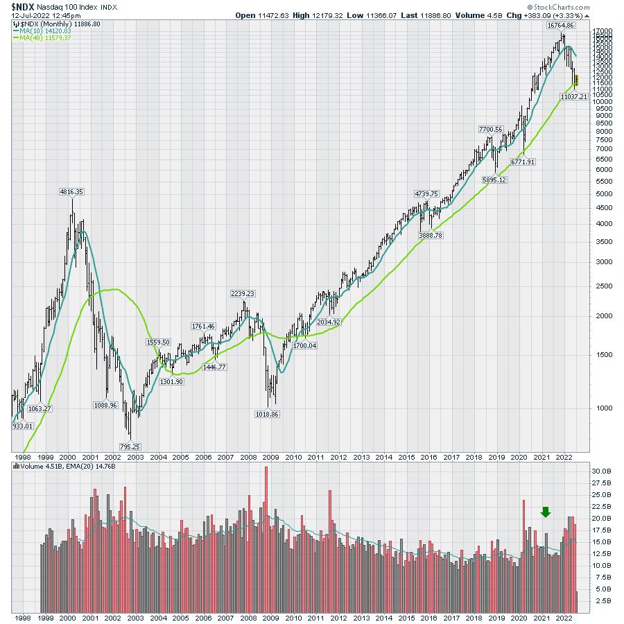
Moving to the monthly chart, we are testing the 40-month moving average. This has been an excellent long term trend indicator.
I do think if we break much more, the problem is the confluence of events that happens. Companies have a certain stock price as part of their debt, and when prices fall below that they start to impair companies ability to hold debt.
One amazing thing to notice is how the volume changed after COVID. 2022 Has seen a lot more volume.
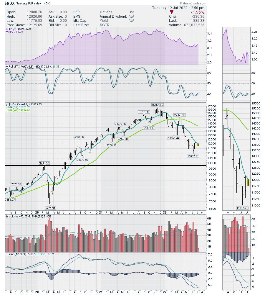
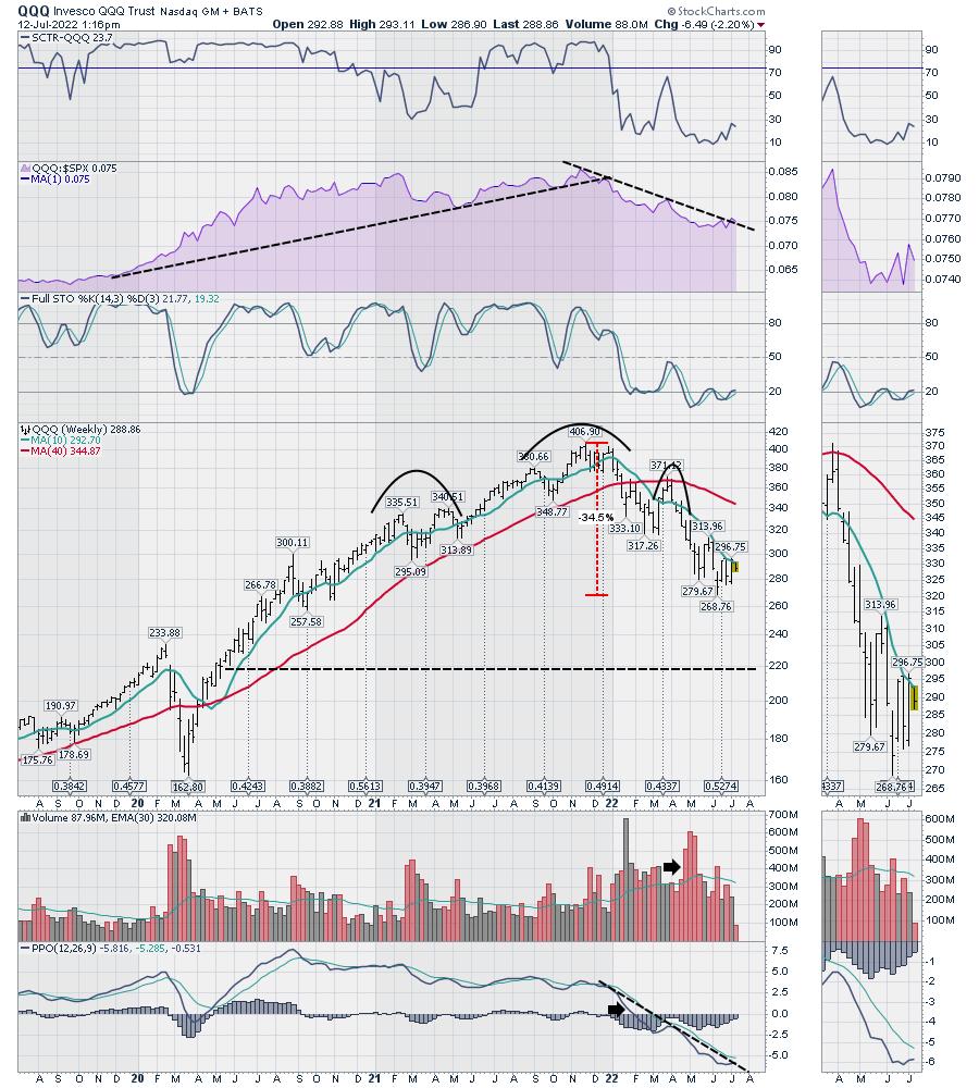
Moving to weekly, the information gets more illustrative. We have been stuck under the 10 week moving average but we are testing it this week. On the volume chart, we can see a lot more volume this year. It also shows how many positive weeks in 2022. The black line is at the 2020 pre-COVID high. For May and June, the nasdaq is performing in line with the $SPX. That can be seen on the purple relative strength area chart. With the PPO looking like it wants to turn up, it gives us a little confidence. However, if you have been putting trades on here, it has been terribly choppy.
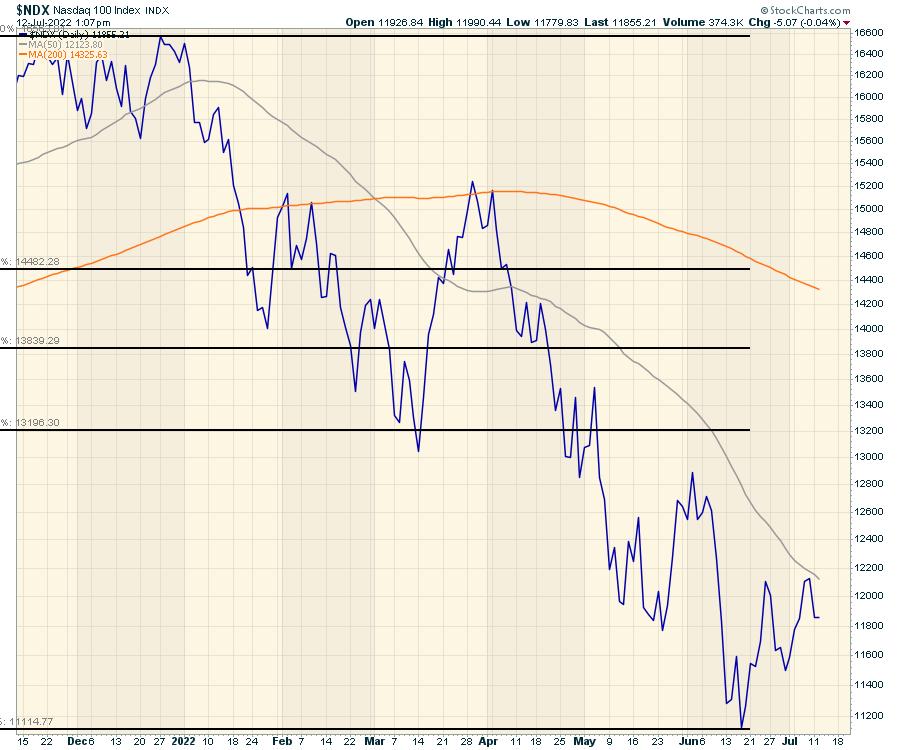
Going to the daily, I’ve got a couple of different views. The first is a view back to the end of 2020. We are currently 7.5% below the closing price of 2020. The topping structure of November / December 2021 really broke down quickly to start 2022. January to March was extremely choppy. That final March high was significant. I will say that the rally off the June lows has not been very smooth so it still appears to be a bear flag.
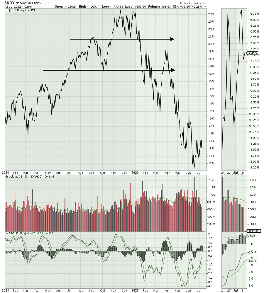
The first target of fibonacci would be meaningfully higher, but that seems out of reach right now.
When I move over to QQQ, I have some other charts. I can use the SCTR indicator which compares the strength of this ETF to other ETF’s. Typically this lives in the top 50% of the ETF universe, but it is still weak. I have drawn a wider head/shoulders top, but it could be drawn with the left side at Sept/ October 2021 as well. Either way, it is a topping formation. If you use the 320 level as the neckline, then the H/S target is 220 where the black line is.
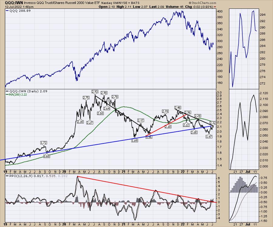
Last week I mentioned the QQQ:IWN ratio as a good indicator of when growth names should start to accelerate. So far, the chart (middle panel) stalled at this important junction.
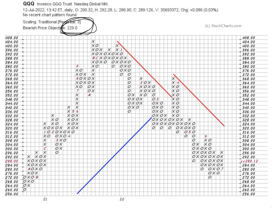
Lastly, let me wrap it up with a PNF chart of the QQQ. The bearish price target on the QQQ is 229, which is close to the H/S target.
This is a very weak market! We have a lot more information available at OspreyStrategic.org for those of you who are interested in weekly market updates. It is not to overwhelm you, but to keep you in tune with what is going on. It is less than $17/week and we also have a trial program.
Stay tuned, it should be a volatile 3rd quarter!